Do you double – and triple! – check your print designs? How can you properly and effectively print with black ink in your design? Are you using QR codes?
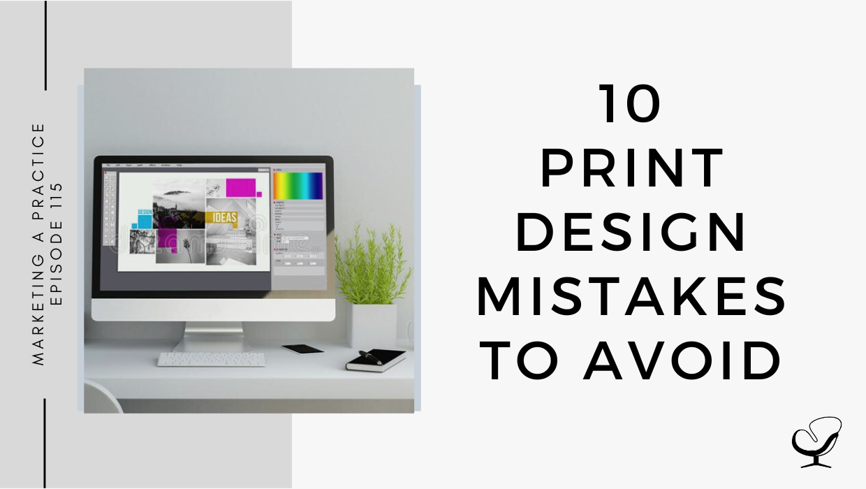
In this podcast episode, Sam Carvalho speaks about 10 print design mistakes to avoid.
Podcast Sponsor: Therapy Notes
Is managing your practice stressing you out? Try TherapyNotes! It makes notes, billing, scheduling, and telehealth a whole lot easier.
Check it out and you will quickly see why TherapyNotes is the highest-rated EHR on TrustPilot with over 1000 verified customer reviews and an average customer rating of 4.9/5 stars.
You’ll notice the difference from the first day you sign up for a trial. They offer live phone support 7 days a week, so when you have questions, you can quickly reach someone who can help, and you are never wasting your time looking for answers.
If you are coming from another EHR, they make the transition really easy. TherapyNotes will import your clients’ demographic data free of charge during your trial so you can get going right away.
Use promo code ‘JOE’ to get three free months to try out TherapyNotes, no strings attached, and remember, telehealth is included with every subscription free. Make 2022 the best year yet with TherapyNotes.
In This Podcast
No bleeds and margins
Low resolution
Wrong color profile
Designed for poor readability
Not considering the material color
Not double (and triple) checking for mistakes
You don’t really know how to use black
Your letters are too thin
You haven’t embedded your graphics and text
Illogical social media promotions
No bleeds and margins
Bleed is the part of your design that extends outside of the print area, and margins are the inner edges of your print. Without bleed, a cutting error can result in exposed white space, which can hurt the look of an otherwise acceptable print.
A 3mm of bleed on all sides is usually good enough to avoid this.
Also, without set margins, you may end up putting important design elements (like text) way too close to a document’s edge, which may result in parts being cut out.
Sam Carvalho
Low resolution
If you’re finding that your images or graphics are coming out blurry when printed, it could be that the resolution or DPI is too low.
Sam Carvalho
For print materials, 300dpi is the usual standard.
For larger-scale prints, you can go as low as 150dpi.
The resolution goes hand in hand with the correct size.
Wrong color profile
Screens use RGB (red, green, and blue) light to render images. A vast rate of colors is possible, including colors that can’t be printed because they have the added factor of screen luminance.
Printers, on the other hand, use CMYK (cyan, magenta, yellow, and black) inks to render images. When you build your design in CMYK, you’re already previewing the colors that can be printed. This way, you have more control over the printed design.
Designed for poor readability
Some design mistakes that will render your printout unreadable or unappealing include:
Tiny text
Long lines of text
Too many fonts
Bad kerning and leading
Kerning is the space between text characters, and leading is the space between lines of copy. When kerning and leading are too narrow or wide or, even worse, erratic, your text becomes hard to understand.
Sam Carvalho
Lack of negative or white space:
It may be tempting to fill up every square inch of your layout with elements, but actually, blank spaces serve a purpose of their own. They highlight more important elements and it can be hard to get a message across when there is too much going on.
Sam Carvalho
Lack of alignment
Lack of contrast
Not considering the material color
Depending on the printing method and material or paper used, certain colors may be either difficult or impossible to replicate.
Using colored paper or material could be an option, provided the available colors fit your color palette. Consider the texture of the paper or material too because it could end up adding extra depth or texture to the final product.
Not double (and triple) checking for mistakes
In print design, it is fundamental that you permit yourself time to verify your content for any typographical, accentuation, and linguistic mistakes.
Keep in mind that a lost comma can drastically change the significance of a sentence, or a missing period or hyphen in an email address can make it impossible for potential clients to contact you.
Sam Carvalho
You don’t really know how to use black
Use the following code for printing black: C0; M0; Y0; K100. However, when you apply this to a larger area, you will see that the black tone will look almost grey.
So, for best results, you want to switch to a rick black by mixing several ink colors to get a darker tone. Try C40; M30; Y30; K100. If possible, try to check directly with your printer what their specifications for rich black are.
Your letters are too thin
Be careful with fine hairlines and tiny text. Also, avoid using small text on a rich black background in print.
Therefore, when you have white text over black, use C0; M0; Y0; K100 simple black.
You haven’t embedded your graphics and text
Make sure to embed all fonts in your artwork before sending it to the printer.
Outlining any stroke in your artwork to convert them into shapes and flattening all your work layers are also good practices.
Illogical social media promotions
Avoid printing links, because it doesn’t work. Replace links and buttons with a QR code.
Useful links mentioned in this episode:
Use promo code ‘JOE’ to get three free months to try out TherapyNotes, no strings attached, and remember, telehealth is included with every subscription free.
Sam Carvalho is a graphic designer living in Cape Town, South Africa, with over five years of experience in both design and marketing, with a special interest and experience in the start-up environment.
She has been working with Practice of the Practice since 2016 and has helped over 70 therapist entrepreneurs take their practices to the next level by enhancing their visual branding. She loves working with a variety of clients on design-intensive tasks and is always up for a challenge!
Feel free to leave a comment below or share this podcast on social media links below! Alternatively, leave a review on iTunes and subscribe!
Podcast Transcription
[SAM CARVALHO]
Welcome to the Marketing a Practice podcast with me, Sam Carvalho, where you’ll discover everything you need to know about marketing and branding your business. To find out more about how I can help you brand new business visit www.practiceofthepractice.com/branding. If you’d like to see some examples of my design work, be sure to follow me on Instagram at Samantha Carvalho Design.
Hi there. Thanks so much for joining me on the Marketing a Practice podcast. Today is just me. I do apologize for my voice, I do have a bit of a cold at the moment, but I’m going to be chatting through some common print design mistakes. If you missed the episode before this, I spoke through 15 common digital design mistakes and as mentioned in this episode, I’m going to be following a similar theme, but with regards to print design. Unfortunately, we’ve all been there, and when I say we, I mean designers. If you’ve ever attempted to do a print design, sometimes there is just a magical black hole between your computer and the printer in which everything goes wrong.
[SAM CARVALHO]
Your leaflet comes at wonky, the text is running off the edge of your brochure or your billboard is totally unreadable. At one time or another, many designers have said it looked right on the screen. So here are some of the most common print design mistakes that could be causing these frustrations. Number one is no bleeds and margins. Without a doubt, bleeds and margins are the most important element of print design. Bleed refers to the part of your design that extends outside of the print area, while margins are the inner edges of your print. While minor errors in cutting can rarely be avoided without a bleed, a cutting area can result in exposed white space, which can hurt the look of an otherwise acceptable print design. As a rule of thumb, three millimeters of bleed on all sides is usually good enough to avoid this. Also, without set margins, you may end up putting important design elements like text, way too close to a documents edge, which may result in parts being cut out. So remember to include your bleeds and your margins.
[SAM CARVALHO]
Number two is low resolution. If you’re finding that your images or graphics are coming out blurry when printed, it could be that their resolution or DPI is too low. DPI means dots per inch, and a higher number means a denser, more faithful and sharper print. For print materials, 300 DPI is the usual standard. For larger scale prints, you can go as low as 150 DPI. Note that that the dots per inch count alone doesn’t matter. The resolution goes hand in hand with the correct size.
[SAM CARVALHO]
Number three is the wrong color profile. There may have been an instance in the past where you were excited to receive your vibrant printout, but when it arrived, the colors were disappointingly flat and really different from what the design looked like on screen. Chances are your design was created and viewed in RGB, which is the wrong color. Profile designs meant for print should be created in CMYK. What’s the difference? Screens use RGB, which stands for red, green, and blue light to render images. A vast rate of colors is possible, including colors that can’t be printed because they have the added factor of screen luminance. Printers, on the other hand, use C MYK, which stands for cyan, magenta, yellow, and black inks to render images. So when you build your design in CMYK, you are already previewing the colors that can be printed, and in this way, you have more control over the printed design.
[SAM CARVALHO]
Number four is designed for poor readability. Many print mistakes are inherent to the loud itself, so here are a few mistakes that will render your printouts unreadable or unappealing. The first is tiny text. As a rule of thumb for labels and flyers, you want to make sure that your text is set to four to six points minimum. Long lines of text is another mistake. Whether your audience reads from left to right or right to left or even vertically, don’t make their eyes travel in one direction for too long. Instead, try to limit the number of characters per line. Too many fonts is also an issue, so while experimenting with fonts can be fun, you rarely have to limit your font used to three at the most. More than that starts to get confusing and makes the design look ugly.
Bad kerning and letting is also something to watch out for. Kerning is the space between text characters and letting is the space between lines of copy. When kerning and letting are too narrow or wide or even worse erratic, your text becomes hard to understand. Lack of negative white space is another design mistake. When it comes to layout, it may be tempting to fill up every square inch of your layout with elements, but actually blank spaces serve a purpose of their own. They highlight more important elements, and it can be hard to get a message across when there is too much going on.
Lack of alignment is another one. While absolute symmetry in your design is not required, there are a few rules to follow. Misaligned elements are jarring and unprofessional, and after all, if you can’t align your headers with your body text, what can readers trust you with? Finally, lack of contrast. Without contrast, you might as well have no content. To give you an idea of what I mean, here are a couple of scenarios lacking contrast; red text on a green background or gray text on a beige background.
[SAM CARVALHO]
Getting back to our overall list of print design mistakes, number five is not considering the material color. It’s easy to forget the paper that your work will be printed on after spending hours perfecting your design. Using a full bleed colored background, for example, may look beautiful on a screen, but it could be a challenge to print. Depending on the printing method and material used certain colors may either be difficult or impossible to replicate. Using colored paper or material could be an option provided that the colors fit your color palette that you’ve used in your design. Also be sure to consider the texture of the paper or material too, which could end up adding extra depth or texture to the final product. Unfortunately, this is something you can’t replicate on your computer screen.
[THERAPY NOTES]
Is managing your practice stressing you out? Try Therapy Notes. It makes notes, billing, scheduling, and tele-health a whole lot easier. Check it out and you will quickly see why it’s the highest rated EHR on Trustpilot with over 1000 verified customer views and an average customer rating of 4.9 out of 5 stars. You’ll notice the difference from the first day you sign up for a trial. They offer live phone support seven days a week so when you have questions, you can quickly reach out to someone who can help. You are never wasting your time looking for answers.
If you’re coming from another EHR, they make the transition really easy. Therapy Notes will import your clients’ demographic data free of charge during your trial so you can get going right away. Use the promo code [JOE], J-O-E to get the first three free months to Try Therapy notes for free. No strings attached. Remember, telehealth is included with every subscription free. Make 2022, the best year yet with Therapy Notes.
[SAM CARVALHO]
Number six is not double and triple checking for mistakes. Another designers’ worst nightmare. You’ve sent your last bit of work off and had it printed up only for the customer to let you know that their phone number on the poster was inaccurate. In print design, more so than digital, it is fundamental that you permit yourself the time to verify your content for any typographical, accentuation, and linguistic mistakes. Obviously in digital, you can possibly always go back and repost it or even correct it and republish it but in print, once it’s printed, it’s printed. Keep in mind that a lost comment can drastically change the significance of a sentence or a missing period or hyphen in an email address can make it impossible for potential clients to contact you.
[SAM CARVALHO]
Number seven is that you don’t really know how to use black. This might sound strange, but when you’re writing down your copy, selecting black as a text full color and think you’re ready to print, well, maybe not. Double click on the black fill you used and check the CMYK code. It may be something like C75, M68, Y67, and K90. Using all four angs to write in black can actually result in blurry text when printed. What you rarely need is to use the following code, C0, M0, Y0, K100. However, if you’re applying this to a larger area, you’ll see that the black tone can look almost gray. So for best results for larger black color areas is you want to switch to a rich black by mixing several ink colors to get a darker tone. You can try something like C40, M30, Y30, K100. If possible, though, the best route is to try to check directly with your printer what their specifications for rich black are.
[SAM CARVALHO]
Number eight is that your letters are too thin. Depending on your printer capacities, your very small and thin characters might not be printed at all. So be careful using fine hairlines and tiny text in your design. Another common mistake is to use small text on a rich black background. The slight misalignments of printing plates might make your characters illegible. So when you have Y text over black use, COMOYO, so when you have Y text over black, use C0, M0, Y0, K100, simple black to avoid this possible blue.
[SAM CARVALHO]
Number nine is you haven’t embedded your graphics and text. Just sending your design for print, even in PDF format is not always a good idea. In all probability, the printers you are working with won’t have that fancy font, and some problems might occur such as some characters being replaced or disappearing altogether. So you want to make sure to embed all font in your artwork before sending it to the printer. Also outlying any stroke in your artwork to convert them into shapes and flattening all your work layers for also good practices.
[SAM CARVALHO]
Finally, illogical social media promotions. This is the 10th and final common print design mistake. Social media doesn’t translate well into print, at least not without some help. That’s why we often see companies promote their Facebook or Twitter presence in strange ways like a Facebook button that doesn’t actually give any indication of how to access the business’s Facebook page. So when you’re promoting social media accounts in print, you have to adjust your social media promotion to account for the differences between print and sign. You can start by replacing links and buttons with a QR code. Links are obviously used in print design, but QR codes root people directly from your design to your social media profiles. Also, don’t feel like you have to promote all of your social media accounts in a single piece.
That’s it guys. I hope you’ve found some value in the 10 common print mistakes, print design mistakes that we’ve discussed today. Thanks so much for joining me and I’ll see you in the next episode.
Thanks again to Therapy Notes for sponsoring this episode. Remember to use the promo code, [JOE], that’s J-O-E, to get three free months to try out Therapy Notes for free, no strings attached.
Thanks for listening to the Marketing a Practice podcast. If you need help with branding your business, whether it be a new logo, rebrand, or you simply want some print flyer designed head on over to www.practiceofthepractice.com/branding. If you’d like to see some examples of my design work, be sure to follow me on Instagram at Samantha Carvalho Design.
Finally, please subscribe, rate, and review this podcast on iTunes if you like what you’ve heard. Talk to you soon.
Marketing a Practice podcast is part of the Practice of the Practice podcast network, a network of podcasts seeking to help you market and grow your business and yourself. To hear other podcasts like Beta Male Revolution, Empowered and Unapologetic, Imperfect Thriving, or Faith in Practice, go to practiceofthepractice.com/network.
This podcast is designed to provide accurate and authoritative information in regards to the subject matter covered. It is given with the understanding that neither the host, the publisher, or the guests are rendering legal, accounting, clinical, or any other professional information. If you want a professional, you should find one.
To provide the best experiences, we use technologies like cookies to store and/or access device information. Consenting to these technologies will allow us to process data such as browsing behavior or unique IDs on this site. Not consenting or withdrawing consent, may adversely affect certain features and functions.
Functional
Always active
The technical storage or access is strictly necessary for the legitimate purpose of enabling the use of a specific service explicitly requested by the subscriber or user, or for the sole purpose of carrying out the transmission of a communication over an electronic communications network.
Preferences
The technical storage or access is necessary for the legitimate purpose of storing preferences that are not requested by the subscriber or user.
Statistics
The technical storage or access that is used exclusively for statistical purposes.The technical storage or access that is used exclusively for anonymous statistical purposes. Without a subpoena, voluntary compliance on the part of your Internet Service Provider, or additional records from a third party, information stored or retrieved for this purpose alone cannot usually be used to identify you.
Marketing
The technical storage or access is required to create user profiles to send advertising, or to track the user on a website or across several websites for similar marketing purposes.