brand identity, color palettes for your private practice, design mistakes, fonts, graphic design mistakes, hierarchy in design, marketing a practice, stock images
Why should you incorporate trends in your new design? Do you use stock images? Are you using hierarchy to your advantage?
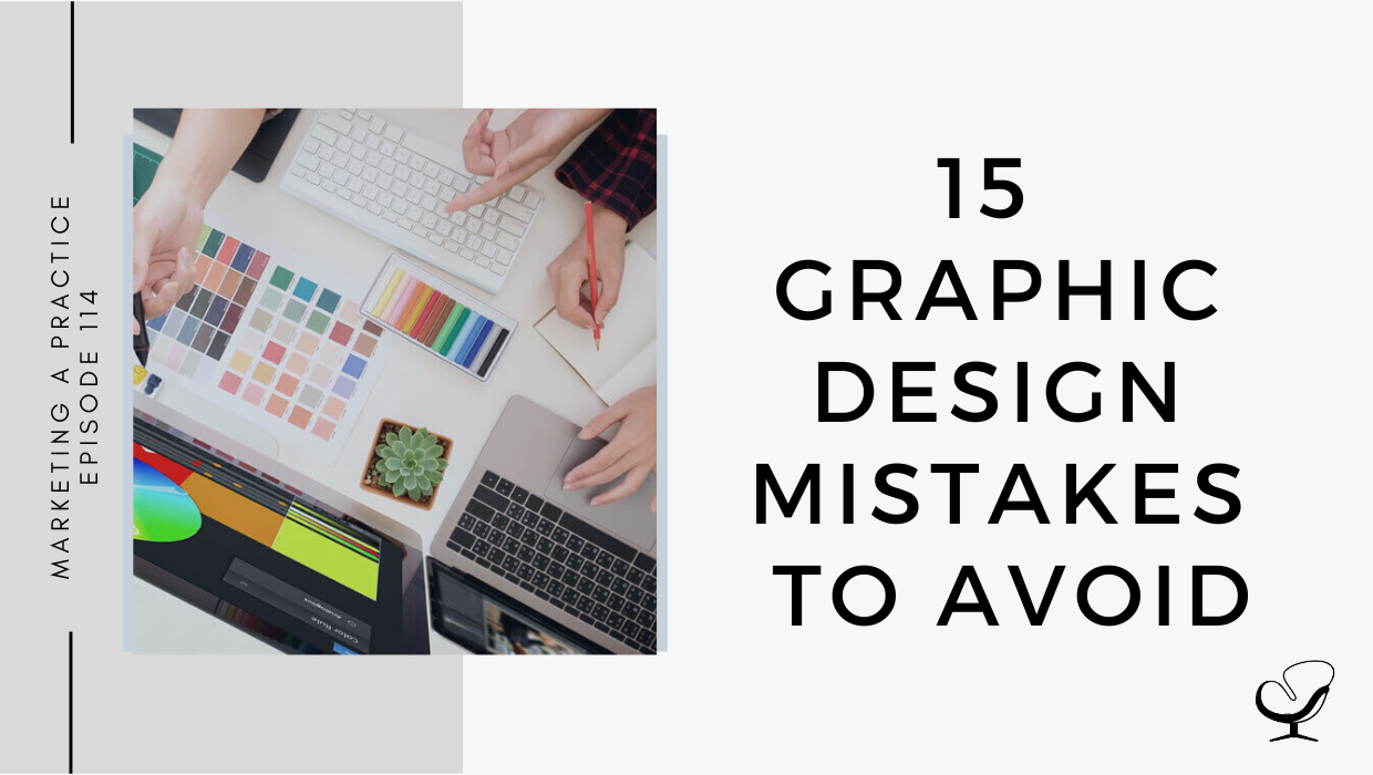
In this podcast episode, Sam Carvalho speaks about 15 graphic design mistakes to avoid.
Podcast Sponsor: Therapy Notes
Is managing your practice stressing you out? Try TherapyNotes! It makes notes, billing, scheduling, and telehealth a whole lot easier.
Check it out and you will quickly see why TherapyNotes is the highest-rated EHR on TrustPilot with over 1000 verified customer reviews and an average customer rating of 4.9/5 stars.
You’ll notice the difference from the first day you sign up for a trial. They offer live phone support 7 days a week, so when you have questions, you can quickly reach someone who can help, and you are never wasting your time looking for answers.
If you are coming from another EHR, they make the transition really easy. TherapyNotes will import your clients’ demographic data free of charge during your trial so you can get going right away.
Use promo code ‘JOE’ to get three free months to try out TherapyNotes, no strings attached, and remember, telehealth is included with every subscription free. Make 2022 the best year yet with TherapyNotes.
In This Podcast
Too many fonts
Using stock images
Not proofreading
Choosing the wrong colors
Using incorrect hierarchy
Designing for the wrong medium
Saving in the incorrect format
Not creating a versatile design
Lack of negative space
No visuals in your blog
Not adjusting images for social media
Using words instead of visuals
Placing the call to action in the wrong place
Thinking “desktop-first”
Ignoring current trends
Too many fonts
It’s hard to understand the message of a piece if there are too many distracting fonts involved. Keep it simple!
Using a single font can also be impactful since it adds continuity and establishes your brand identity.
Sam Carvalho
Also, keep in mind the kerning of your fonts. Adjusting the space between letters can make the words more legible and help with the overall appearance of the words.
Using stock images
Many common stock photos become overused which makes it a dead giveaway when you put them in your marketing piece.
If you do end up deciding to use stock images then make sure you are properly purchasing the photos to avoid watermarks or ones that are low resolution.
Not proofreading
Make sure you are always checking over the spelling and grammar before publishing a piece. Clients may deem your business unprofessional due to a tiny spelling mistake.
To avoid this, try to get a second pair of eyes on your work to pick up any possible errors you may have missed.
Sam Carvalho
Choosing the wrong colors
When creating new branding for your company or new artwork, it’s important to start by creating a color palette. Your color palettes should include primary and secondary colors. Be sure to test your fonts along with these colors to make sure that the text is legible whether standing alone or sitting on top of other elements.
Using incorrect hierarchy
Hierarchy is how a piece is organized so that the audience knows which elements are the most important because it guides their eye movement.
Hierarchy is the top design technique that ranks the importance of your information.
Sam Carvalho
Hierarchy doesn’t just have to be font size or placement. You can also create an effective hierarchy through colors, graphic elements, or the weight of fonts you use.
Designing for the wrong medium
Whether you design for social media, your website, or in print, the medium that you use will guide how you create your design.
If your design is digital, then create it in RGB (red, green, blue) which is used to display a range of colors digitally.
If you design in the CMYK format (cyan, magenta, yellow, and key (black)) then you would be using four-color process printing.
Saving in the incorrect format
Does your image need to be in raster or vector format?
Raster images are made up of pixels while vectors are made up of geometric lines and curves, which means they can be scaled to any size while keeping their shape.
Sam Carvalho
To avoid pixilation, a good rule of thumb is to make your design bigger than it needs to be. You can always reduce resolution, but you can never increase it.
The three most common file types for web-based images are .jpg, .png, and .gif:
JPG images are ideal for files with gradients and allow for a smaller file size through compression.
PNG Images are lossless, so they do not lose quality during editing, support transparency, and tend to be larger than a JPG.
GIF images can maintain a low file size while being able to support animation.
Not creating a versatile design
If you’re creating a logo, think about:
how it will look on promotional products
how it will look in one color or full color
how it can be simplified to ensure you’re able to use specific design processes with your logo.
Lack of negative space
Instead of looking at white space as empty space, consider it like any other important element of design.
No visuals in your blog
It is a fact that blog headers and social media graphics that stand out from the crowd can heavily influence click-through rates.
A good way of maintaining client engagement is by using visuals that back up your written words. Consider infographics, charts, diagrams, images, and calls-to-action.
Not adjusting images for social media
Even if you’re using the same post across multiple social media channels, be aware that the design needs to be resized to appear nicely on each channel.
Using words instead of visuals
The fastest way to turn your audience off is by including too much text in a piece of content that’s supposed to be primarily visual.
You don’t need to repeat the words that you want your design to express. Instead, let the design speak for itself.
Sam Carvalho
Placing the call to action in the wrong place
The best place to put your call-to-action is in the bottom right corner. Why? Because you never want to force users to backtrack in your design to click a button. You want a call-to-action button in a design where the user will find it after reading about the offer or benefits.
Thinking “desktop-first”
Think “mobile-first” because that is how most people are consuming information and digital media.
Make sure you keep things simple. Imagine someone viewing it on a small screen and ensuring that your design also works for that size.
Ignoring current trends
Current graphic design trends should be considered and evaluated to see whether any are relevant to your brand and can be incorporated.
Refreshing your creatives is a great way to keep your audience interested.
Useful links mentioned in this episode:
Use promo code ‘JOE’ to get three free months to try out TherapyNotes, no strings attached, and remember, telehealth is included with every subscription free.
Sam Carvalho is a graphic designer living in Cape Town, South Africa, with over five years of experience in both design and marketing, with a special interest and experience in the start-up environment.
She has been working with Practice of the Practice since 2016 and has helped over 70 therapist entrepreneurs take their practices to the next level by enhancing their visual branding. She loves working with a variety of clients on design-intensive tasks and is always up for a challenge!
Feel free to leave a comment below or share this podcast on social media links below! Alternatively, leave a review on iTunes and subscribe!
Podcast Transcription
[SAM CARVALHO]
Welcome to the Marketing a Practice podcast with me, Sam Carvalho, where you’ll discover everything you need to know about marketing and branding your business. To find out more about how I can help you brand new business visit www.practiceofthepractice.com/branding. If you’d like to see some examples of my design work, be sure to follow me on Instagram at Samantha Carvalho Design.
Hi there. Thanks so much for joining me today on the Marketing a Practice podcast. Today’s episode is just me and I do apologize for my voice. I do currently have a bit of a cold but I wanted to chat through some graphic design mistakes particularly with regards to digital design. In the next episode, I’m going to be chatting through some print design mistakes. Obviously, in today’s day and age most of our stuff will be centered around digital so it’s your website, your social media things like that. You’ll spend, you’ll find that you’ll spend a lot of your time creating designs for digital marketing. In line with that, I wanted to just cover some general mistakes to be aware of and that you can hopefully avoid in the future when creating your digital marketing assets.
[SAM CARVALHO]
The first one is too many fonts. This is often a telltale sign of a novice design versus a professional design. It’s hard to understand the message of a piece if there are too many distracting fonts involved. As fun as it can be to play with fonts to convey different feelings and messages, brands should rather pick two or three fonts maximum on any design piece. This is also where your brand style guide can come in handy because if you from the get-go, choose a couple or three fonts that you want associated with your brand, then moving forward, anything that you design will include those said fonts.
Using a single font can also be impactful since it adds continuity and establishes your brand identity. Make sure that you keep the size of the piece in mind when selecting the number of fonts as well as the amount of text. Also keep in mind the kering of your font. The kering is the space between the letters, which makes a big difference on the finished product of your artwork. Adjusting the space between letters can make the words more legible and help with the overall appearance of the words.
[SAM CARVALHO]
Number two is using stock images. Stock images can be a helpful and affordable solution when you’re working on a project that requires specific images. However, using too many stock photos can make your project look cheap or unprofessional, and many common stock photos become overused, which then makes it a dead giveaway when you include them in your marketing piece. So think very carefully about whether or not to include stock photos if you do decide to don’t overdo it. Also make sure that you properly purchase the photos to avoid sending out photos with their watermark or ones that are lower resolution. Ideally, taking your own photography and including those photos is what’s going to make a brand stand out above the rest.
[SAM CARVALHO]
Number three is not proofreading. Make sure that you are always checking over the spelling and grammar before publishing a piece. While I misused comma or other punctuation mark May not seem like a major problem, there are plenty of people out there who will notice common issues like this and then ignore the rest of the information. Clients may not take these mistakes kindly and simply deem your business as unprofessional to even to tiny spelling mistakes. To avoid this, try to get a second pair of eyes on your work to pick up any possible areas that you may have missed.
[SAM CARVALHO]
Number four is choosing the wrong colors. Similar to using too many font, choosing too many colors or choosing the wrong colors can also make a design ineffective. It can be distracting to use too many bold colors in one piece. So when creating branding for your company or a new artwork, it’s important to start by creating a color palette. Again, if you have an established brand style guide that includes your brand’s color palette, then this isn’t something that you need to revisit every time you create a new piece of artwork. You can simply make use of the color palette that is already associated with your brand. Each color palette that you create should include both primary and secondary colors, and be sure to test your font along with these colors to make sure that the text is legible, whether standing alone or sitting on top of other elements.
[SAM CARVALHO]
Number five is using incorrect hierarchy. In graphic design, hierarchy is how a piece is organized so that the audience knows which elements are the most important and they know how their eyes should move over the piece. Hierarchy is the top design technique that ranks the importance of your information. Whenever you’re creating a new design, there’s typically one general message that you want to communicate, whether you’re communicating a sale, upcoming event, or new blog post, how you create hierarchy in your design will dictate what your audience takes away from that design. Hierarchy doesn’t just have to be fun, size, or placement. It can also be effectively created through colors, graphic elements, or the weight of the font that you use.
[SAM CARVALHO]
Number six is designing for the wrong medium. The first decision you should make when you’re starting an artwork is where it will be appearing. Whether it’ll be used on social media, your website, or in print makes a big difference on how you should be creating your design. So if your design is going to appear on a digital screen, it should be created in RGB, which stands for red, green, and blue. These are the colors of the light screens used to display a range of colors. If you create a design in CMYK format, which stands cyan, magenta, yellow, and black, which is used for full color process printing once published, it’ll look completely different because the colors won’t translate how they should.
[THERAPY NOTES]
Is managing your practice stressing you out? Try Therapy Notes. It makes notes, billing, scheduling, and telehealth a whole lot easier. Check it out and you’ll quickly see why Therapy Notes is the highest rated EHR on TrustPilot with over 1000 verified customer reviews and an average customer rating of 4.9 out of 5 stars. You’ll notice the difference from the first day you sign up for a trial. They offer live phone support seven days a week so when you have questions, you can quickly reach someone who can help, and you are never wasting your time looking for answers. If you are coming from another EHR, they make the transition really easy. Therapy Notes will import your client’s demographic data free of charge during your trial, so you can get going right away. Use the promo code Joe, that’s [JOE] to get three free months to try Therapy Notes for free, no strings attached. Remember, telehealth is included with every subscription free. Make 2022 the best year yet with Therapy notes.
[SAM CARVALHO]
Number seven is saving in the wrong format. When choosing a file format for your design image, think about whether or not the image needs to be in raster or vector format. Raster images are made up of pixels, while vectors are made up of geometric lines and curves, which means that they can be scaled to any size while keeping their shape. You may also hear vector files referred to as AI files because vector artwork is typically created in Adobe Illustrator. If you are worried about your design getting pixelated, a rule of thumb is to make your design bigger than it needs to be. You can always reduce resolution, but you can never increase it.
The three most common file types for web web-based images are jpeg, PNG and gif. JPEG images are ideal for files with gradients and allow for a smaller file size through compression. PNG images are lossless, which means that they don’t lose quality during editing. They support transparency and they tend to be larger than a jpeg. Gif images can maintain a low file size while being able to support animation. A few other common file types like pdf, PSD and AI refer to where the specific file was created. A PDF incorporates all elements of a printed document as an image that you can view, print or send to somebody else. PSD refers to a file created in Adobe Photoshop and AI refers to a file created in a Adobe Illustrator.
[SAM CARVALHO]
Number eight is not creating a versatile design. The best graphics are ever green and multipurpose. So if you’re creating a logo, think about how it’ll look on promotional products, how it’ll look in one color or in full color, and how it can be simplified to ensure that you’re able to use specific design processes with your logo. This will help establish your brand consistency and save you time and money from having to redesign artwork for new projects down the road.
[SAM CARVALHO]
Number nine is lack of negative space. Another sure sign of an amateur designer is the lack of white or negative space in a visual design. Instead of looking at white space as empty space, consider it as another important element of the design. A good example is the Google webpage. If you visit the Google webpage, you’ll know, or even if you just think about it now, you’ll know that there’s tons of white space and that the Google logo exists in the very center and isn’t even that big, but you’re never roaming around wondering where the search bar is.
[SAM CARVALHO]
Number 10 is not including visuals in your blog. The truth of the matter is if your blog doesn’t look good, no one will read it. Yes, even if you have the best long form content in the world, no one will read it. What’s worse? No one will care about your brand either. It’s no secret that first impressions count, and that’s regardless of the actual content. It’s a fact that blog headers and social media graphics that stand out from the crowd can heavily influence click-through rates. Then once clients are actually engaging with your content, you need to keep them engaged. A good way of doing this is by using visuals that back up your written words. Think of infographics, charts, diagrams, images, and calls-to-action. Bespoke designs and graphics can help your brand be different from its competition.
[SAM CARVALHO]
Number 11 is not adjusting for social media. This is a pretty massive graphic design mistake, failing to resize images for various social media platforms. Even if you’re using the same posed across multiple social media channels be aware that the design needs to be resized in order to appear nicely on each channel. Number 12 is using words instead of visuals. The fastest way to turn your audience off is by including too much text in a piece of content that’s supposed to be primarily visual. This is especially true when it comes to presentation design, infographics, or blog headers. You don’t need to repeat the words that you want your design to express. Instead, let the design speak for itself. Number 13 is placing the call-to-action in the wrong place. In Western culture, we read top to down and left to right. Keeping this flow in mind can help you make better decisions as to where to place your call to action. Essentially, the bestest place to put it is in the bottom right corner. Why? Because you never want to force users to backtrack your design in order to click a button. Instead, you would want a call to action button in a design where the usable find it after reading about the offer or benefits.
[SAM CARVALHO]
Number 14 is thinking desktop first. Thinking desktop first is a huge mistake. You actually want to be thinking mobile first for all content that you design as that is how most people are consuming things. Mobile devices take up 70% of the time spent on digital media. Therefore, you want to make sure that you keep things simple and imagine someone viewing it on a small screen and ensure that your design also works for that size. You want to pull out the important content and make sure that that’s what your audience takes action on.
[SAM CARVALHO]
Finally, the 15th common digital design mistake is ignoring current trends. While I agree that not all trends are going to align with your brand and that you definitely shouldn’t jump on every single bandwagon, current graphic design trends should be considered and evaluated to see whether any are relevant to your brand and can be incorporated. Furthermore, refreshing your creatives every once in a while is a great way to keep your audience interested. Just remember, though, that you’ll want to test how your audience reacts, so don’t create a huge catalog of designs without testing them first.
That’s it guys, just 15 tips or rather, 15 common graphic design mistakes that hopefully you can avoid in the future. I hope you’ve gained value from this episode and I’ll see you in the next one.
Thanks to Therapy Notes for sponsoring this episode. Remember to use the promo code [JOE] to get three free months to try out Therapy Notes for free, no strings attached.
Thanks for listening to the Marketing a Practice podcast. If you need help with branding your business, whether it be a new logo, rebrand, or you simply want some print flyer designed head on over to www.practiceofthepractice.com/branding. If you’d like to see some examples of my design work, be sure to follow me on Instagram at Samantha Carvalho Design.
Finally, please subscribe, rate, and review this podcast on iTunes if you like what you’ve heard. Talk to you soon.
Marketing a Practice podcast is part of the Practice of the Practice podcast network, a network of podcasts seeking to help you market and grow your business and yourself. To hear other podcasts like Beta Male Revolution, Empowered and Unapologetic, Imperfect Thriving, or Faith in Practice, go to practiceofthepractice.com/network.
This podcast is designed to provide accurate and authoritative information in regards to the subject matter covered. It is given with the understanding that neither the host, the publisher, or the guests are rendering legal, accounting, clinical, or any other professional information. If you want a professional, you should find one.
To provide the best experiences, we use technologies like cookies to store and/or access device information. Consenting to these technologies will allow us to process data such as browsing behavior or unique IDs on this site. Not consenting or withdrawing consent, may adversely affect certain features and functions.
Functional
Always active
The technical storage or access is strictly necessary for the legitimate purpose of enabling the use of a specific service explicitly requested by the subscriber or user, or for the sole purpose of carrying out the transmission of a communication over an electronic communications network.
Preferences
The technical storage or access is necessary for the legitimate purpose of storing preferences that are not requested by the subscriber or user.
Statistics
The technical storage or access that is used exclusively for statistical purposes.The technical storage or access that is used exclusively for anonymous statistical purposes. Without a subpoena, voluntary compliance on the part of your Internet Service Provider, or additional records from a third party, information stored or retrieved for this purpose alone cannot usually be used to identify you.
Marketing
The technical storage or access is required to create user profiles to send advertising, or to track the user on a website or across several websites for similar marketing purposes.