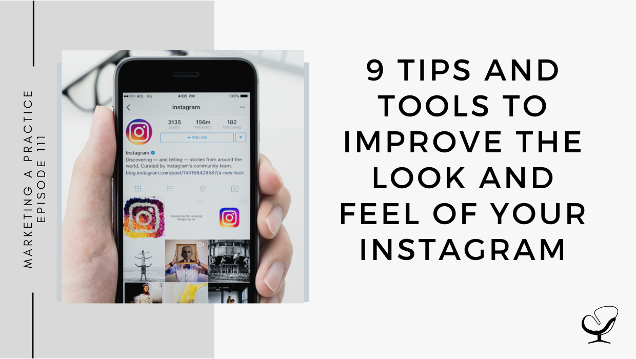
Is Instagram one of your main marketing platforms? What’s a great way to make use of the grid design? Do you want to learn how you can get the most out of your marketing efforts by learning about some inside Instagram tips and tricks?
In this podcast episode, Sam Carvalho speaks about 9 tips and tools to improve the look and feel of your Instagram.
Podcast Sponsor: Brighter Vision
It’s that time of year again!
My friends over at Brighter Vision are once again kicking off the fall season with a month-long digital conference event they call ‘Fall Into Cash’.
For the entire month of September, they’ll be teaming up with the top brands, consultants, and coaches in the mental health industry to provide you with the best advice, tools, content, podcasts, and giveaways; all centered around one main goal – helping you grow your practice and make more money.
Plus, in celebration of the 6th anniversary of ‘Fall Into Cash’, they’re also offering a very special discount exclusively for Practice of the Practice listeners.
From now until the end of the month, they’re offering $20/month off of any website service plan for your whole first year plus no signup fees – that’s a savings of over $200!
For more information and to take advantage of this great offer, head on over to brightervision.com/joe.
In This Podcast
Consider color combinations
White space
Relevant imagery
Keep it simple
Be creative
Don’t be afraid to use stock images
Find your flow
Grid design ideas
Create branded highlight covers
Consider color combinations
It goes without saying that color is one of the most important design elements. It’s the first thing people notice and it can help set the feel for your feed. Color is so powerful that it can create a specific atmosphere and even evoke a certain memory from your viewers.
Sam Carvalho
Incorporate color theory into your Instagram feed by considering the emotions you want your followers to experience when they land on your page, and that sends the right message about your brand.
Once you have established a color combination, be consistent with it so that people will begin to recognize your images when they show up in their feed.
Make a list of words for yourself that relate to your brand.
Be specific, hone in on your niche, and then branch from there.
Sam’s tool suggestion: your smartphone!
Keep it simple
The best graphic design tip for your Instagram feed is to keep things simple.
Post a picture you think your followers would find interesting, and it doesn’t have to be a posed photo; in fact, subject matter that’s snapped in its “natural habitat” often works a lot better than heavily-staged photos.
Instagram, at its core, is a creative, visual channel. So, you shouldn’t limit yourself to what everyone else is doing. The more creative you can get, the better. Especially if this goes hand in hand with your brand.
Sam Carvalho
Some of the most popular Instagram accounts have something different about them, whether it’s an unusual choice of colors, quirky set-ups, or sharing a subject matter that’s noticeably different from the rest.
Don’t be afraid to think outside of the box. The more you play around, the quicker you’ll find out what your audience responds to best.
You can find stock images that are authentic, relevant to your brand, and that also help you to stick to the color and content themes of your feed. You can search online for images that match your color palette.
Instagram is all about figuring out what is relevant to your brand. That applies to your actual content (the what), and the curation and design of your Instagram feed (the when and the how).
You can develop and work with a strict social media strategy that posts for you through automated platforms.
Or, you can wing it. Being spontaneous could shift the visual flow of your feed, but some people make it work. This works for their brand and can create a more authentic experience for their followers.
You can figure out who you are and what works best for you. You could even find a balance between curating and going with the flow … schedule some posts, but supplement them with quirky things that come up in your day-to-day life. Whatever works for you!
Commit to a color combination: pick a color palette or certain tone to feature in every photo.
Create a checkerboard effect: by alternating the style of photo you post, you can create a checkerboard look on your grid.
[Try] alternating text quotes with photography or mixing close-up shots with landscape photos, or going back and forth with two distinct colors can work too.
Sam Carvalho
Design row by row: uniting the images on each row by theme or color can create a powerful impact.
The trick with this one is that you’ll have to post three images at a time, or the alignment will be off … if you’re bold enough, you could even experiment with panoramic images for one of your rows.
Sam Carvalho
Create a vertical column: breaking up the grid with squares that create a vertical, central image is a great way to mix graphic branding elements and photography on your profile
Turn your grid into a rainbow: the goal is to post regularly in one saturated color, transitioning to the next shade in the rainbow with your next row of posts.
Embrace the border: creating a consistent look can be as simple as applying a border to all of your images.
Turn your posts into a puzzle: for a big announcement or campaign, a puzzle grid packs a punch.
If you want to save stories for longer than 24 hours, you can add them to various highlights at the top of your profile.
You can create custom covers for each of these highlights, and I highly recommend that. Make sure these covers match your brand and mesh well with your feed since they’re viewable at the top of your profile.
From now until the end of the month, Brighter Vision are offering $20/month off of any website service plan for your whole first year plus no signup fees – that’s a savings of over $200! For more information and to take advantage of this great offer, head on over to brightervision.com/joe.
Sam Carvalho is a graphic designer living in Cape Town, South Africa, with over five years of experience in both design and marketing, with a special interest and experience in the start-up environment.
She has been working with Practice of the Practice since 2016 and has helped over 70 therapist entrepreneurs take their practices to the next level by enhancing their visual branding. She loves working with a variety of clients on design-intensive tasks and is always up for a challenge!
Feel free to leave a comment below or share this podcast on social media by clicking on one of the social media links below! Alternatively, leave a review on iTunes and subscribe!
Podcast Transcription
[SAM CARVALHO]
Welcome to the Marketing a Practice podcast with me, Sam Carvalho, where you’ll discover everything you need to know about marketing and branding your business. To find out more about how I can help you brand new business visit www.practiceofthepractice.com/branding. If you’d like to see some examples of my design work, be sure to follow me on Instagram at Samantha Carvalho Design.
Hi there, thanks so much for joining me today on the Marketing a Practice podcast. Today it’s just me and I wanted to hone in on Instagram and some tips around how to improve your design and look and feel on Instagram. As an inherently visual social media channel, it’s vital that your Instagram feed looks good. If you’re posting blurry images with dodgy lighting, you’re not going to get as much engagement than if you’re posting bright pictures with crisp visuals. So if you’re like me and you’re a creative aesthetic person when you’re on Instagram, you’re not simply going to be scrolling through the posts that appear on your feed. You’re going to be clicking through to people’s profiles and looking at their overall grid and overall look and feel and seeing how they present themselves.
I realize that not everybody’s going to do this, but the more followers that you get on Instagram, the more effort you’re going need to put into your look and feel to make sure that it’s professional, that it’s consistent with your branding and that it stands out above the rest. Luckily, you don’t have to be a design pro to make your feed stand out. Within this podcast, I’m going to be sharing some simple tips to make sure that your Instagram account pops and stands out amongst your competitors. As usual, the format that I follow when it’s just me is just going through a number of quick fire tips for you to delve into when you get the chance.
[SAM CARVALHO]
Number one is to consider color combinations. It goes without saying that color is one of the most important design elements. It’s the first thing that people notice and it can help set the feel for your feed. In fact, color is so powerful that it can create a specific atmosphere and even evoke certain memory from your viewers. Color theory is actually really fascinating if you begin to dig into it a little deeper. Each and every color has a meaning behind it and relates to a specific feeling or mood. For example, a cool blue evokes a sense of calm peacefulness that a bright red just doesn’t. By incorporating color theory into your Instagram feed, you can evoke certain emotions in your followers that they experience when they land on your page and that sends the right message about your brand. Then once you’ve established a color combination, you need to be consistent with it so that people start to recognize your pictures when they pop up in their feed.
In this episode, I’m going to be suggesting tools with each tip, and the tool suggestion for this tip is to visit color.adobe.com. I’ve mentioned it before, but it’s a great tool when you can go and experiment and play around with different schemes even by uploading an image that you like and it will extract the color scheme from that image. Or if you go to the explore tab, you can literally type in things like peace or happiness and it will come up with the associated color schemes for that feeling. Definitely go check it out if you are looking for a color combination for your Instagram.
[SAM CARVALHO]
Number two is white space. One of the hardest things to do on Instagram is, on your Instagram feed is to balance out the use of pictures and white space. White space, if you don’t know by now from listening to my podcast, is essentially the space around your subject matter and text. It works by offering breathing room for viewers to rarely soak up your visuals. Pictures that don’t have white space aren’t easy on the eye and it can be a struggle for your followers to rarely determine what they’re about. To avoid this, make sure that you incorporate a lot of white space so that viewers have the chance to really take in what they’re seeing. Again, remember that you have the description area in Instagram to include a lot of your content so the image only needs to grab the person’s attention. Then once you’ve grabbed their attention, you can fill them in more with the content in the description as opposed to trying to put too much content in the image.
The tool suggestion here is the preview app. I actually use it for my Instagram and it allows you to preview the posts that you plan on posting in future so that you can get an idea of what they’re going to look like on your grid. That makes sure that you’re not including too much busyness, that you’re including an image with a lot of white space here and there just to include some breathing room on your grid and make it look a bit better.
[SAM CARVALHO]
Number three is relevant imagery. It goes without saying that your Instagram photo should be relevant to your brand and resonate with your audience. If they’re not and they don’t, your followers are going to get confused and not fully understand what you’re offering and what your value is to them. So start by listing out words that relate to your brand. You can begin by being super specific and then branch out from there. For example, and this is quite a way out example from most of you, but it will give you an idea of what I’m talking about, if you’re a florist, you don’t have to limit yourself to pictures of flowers. You can also share images of things related to flowers like interior design and other natural elements.
My tool suggestion here is simply your smartphone. It might sound weird, but these days our smartphones are equipped with excellent cameras and so you really have what you need to go and take some relevant imagery to post on your Instagram. You don’t need a fancy camera anymore, your smartphone will cut it.
[SAM CARVALHO]
Number four is to keep it simple. You don’t have to be a photography whiz and a dab hand at editing to have a good Instagram feed. In fact, this can actually be detrimental if you don’t know what you’re doing. We’ve all seen those feeds that are so heavily edited that they actually hurt your eyes. Perhaps the best graphic design tip for your Instagram feed is to keep things simple. Don’t try and create elaborate sets for your photos. Instead, take a shot of something you think your followers will find interesting. It doesn’t have to be turned into a post photo. In fact, subject matter that’s snapped in its natural habitat often works better than heavily staged photos, especially now I think people more and more are wanting to see authenticity rather than something that’s been posed and set up.
The tool suggestion here is the Photoshop Lightroom app. Again, this is something that I use for my own Instagram and it allows you to quickly edit your photos more to make sure that they’re all consistent than anything else. You don’t need to be a Photoshop whiz to be able to use it. It’s quite user friendly and if you’d like you can purchase some user presets. So it’s essentially filters that are already set up and you can literally just apply them to your photos. Again, it makes sure that all your photos look similar. That’s something that you can do if you like. Those presets are usually promoted by influencers on Instagram or if you just Google user presets for Instagram or for photos, it’ll definitely come up and you can then load that onto your Photoshop library app.
[SAM CARVALHO]
Number five is to be creative. Here’s the thing, Instagram at its core, like we’ve said, is a creative visual channel. You shouldn’t limit yourself to what everybody else is doing. In fact, the more creative you can get, the better, especially if this goes hand in hand with your brand. You’ll notice that the most popular Instagram accounts, those ones with the wow factor have something a little bit different about them, whether it’s an unusual choice of colors, quirky setups, or if they share subject matter that’s unusual. During your Instagram brainstorming sessions, don’t be afraid to think outside of the box and experiment with the visuals that you post. The more you play around, the quicker you’ll find out what your audience responds to best.
My tool suggestion here is Canva. We’ve mentioned it before, but canva.com is a great free tool that you can use with predesigned templates that you can play around with and add your own content to. Nowadays they’ve added some animation into their templates as well. This is where you can really be creative and try new things on your Instagram.
[BRIGHTER VISION]
It’s that time of year again. My friends over at Brighter Vision are once again kicking off the full season with a month-long digital conference event they call Fall Into Cash. For the entire month of September, they’ll be teaming up with the top brands, consultants and coaches in the mental health industry to provide you with the best advice, tools, content, podcasts and giveaways, all centered around one main goal, helping you grow your practice and make more money. Plus, in celebration of the sixth anniversary of Fall Into Cash that are also offering a very special discount exclusively for Practice of the Practice listeners from now until the end of the month, they’re offering $20 per month off of any website service plan for your whole first year plus no sign-up fees. That’s a saving of over $200. For more information and to take advantage of this great offer, head on over to brightervision.com/joe.
[SAM CARVALHO]
Number six is to not be afraid to use stock photos. If we’re being honest, we don’t all have the time to have photo shoots and sometimes we just don’t have anything interesting to snap up. In these times, stock photos can come to the rescue. You can find ones that are authentic and relevant to your brand. They also help you to stick to the color and content themes of your feed. You can simply search online for images that match your color palette. Whether it’s steps of the city or nature or candid portraits, stock photos could fit onto your feed and help you create the desired aesthetic that you’re going for.
My tool suggestion here is pixels.com or slash.com. Again, I use these sites often in my own design and they offer authentic often unusual imagery that’s a bit different from your normal stock imagery. If you just pop on there and you search for what you’re looking for you’ll be able to find a variation of free, a variety of free photos to use.
[SAM CARVALHO]
Number seven is to find your flow. So like I mentioned before, Instagram is all about figuring out what’s relevant to your brand. That applies to your actual content, which is the what and the creation and the design of your Instagram feed, which is the when and the how. Some people develop strict social media strategies and post through automated platforms. They stick to planned themes like minimal posts with tons of white space. Simply using a common filter is another way to curate your content. This is one option which is sticking to a set plan.
The other option is to wing it. Being haphazard, however, can ruin the visual flow of your feed, but some people genuinely make it work. They transform chaos into order posting randomly and impulsively. This ends up working for their brand and can create a more authentic experience for their followers. I’m someone who sticks with Option A, I stick to a set plan, but there are times when something will happen in my life or something will be happening in the world and I quickly need to jump in and adjust my plan and that makes more work than if I was just posting on the fly, but still making sure that it fits it within my visual plan. So you really need to figure out who you are and what works best for you. You could even try and find a balance between curating and bring with the flow. You could schedule some posts but supplement them with quirky things that come up in your day to day life. That’s sort of what I try and do. Whatever works for you do that.
My tool suggestion here is a content plan. You could use Google Sheets for this or just Excel or numbers, whatever you have on hand and you can loosely string together a content plan or go into more detail depending on what works for you. But it’s a good idea to have some sort of plan in mind.
[SAM CARVALHO]
Number eight is grid design ideas. So as I mentioned previously, something I do often is I jump into people’s profiles and I have a look at their grid and I get a lot of pleasure if it’s a well curated feed. So great Instagram grids start with a vision and if this isn’t something that you’ve even considered before, then here are some style ideas to help you inspire your own look. The first one is to commit to a color combination like we’ve mentioned. This is the most common grid style. You can pick a color palette or a certain tone to feature in every photo, and then you can use a certain filter across your photos to achieve this as well.
You could also create a checkerboard effect. This is by alternating the style of photo you post. You can create a checkerboard effect by alternating text quotes with photography or mixing up closeup shots with landscape photos or going back and forth between two distinct cutters. The third option is to design row by row. This involves uniting the images on each row by theme or color, which can create a powerful impact. The trick with this one however, is that you’ll have to post three images at a time or the alignment will be off. Remember the Instagram grid consists of three images in a row. If you’re bold enough, you could even experiment with a panoramic image for one of your rows which will result in a trio of photos that add up to one long horizontal image.
You could also create a vertical column, so breaking up the grid with squares that create a vertical central image is a great way to mix up graphic branding elements and photography together on your profile. You could also turn your grid into a rainbow. Obviously, this is getting more and more in-depth and here you need both patients and great color senses to pull this off. But the goal is to post regularly in one saturated color and then slowly transition to the next shade in the rainbow or or just in your color scheme with your next row of posts. You could also embrace the border, so you could create a consistent look by simply adding a border to all of your images.
Finally you can turn your posts into a puzzle. Again, this is a more complex option and it’s tricky to pull off on a day-to-day basis, but for a big announcement or campaign, a puzzle grid definitely creates an impact. Essentially, this creates one big interconnected image out of all of the squares that you post. So individually these posts probably look like nonsense, but viewed together, it’s a work of art.
My tool suggestion here is a bit more complex. It’s Adobe Photoshop or Adobe Illustrator. I realize a lot of you won’t be able to use this or yes, it doesn’t come easily to you, but if you are looking to get a bit more creative and complex with your Instagram, then it will be a lot easier to do that within Photoshop or Illustrator. With the boards, you can then also set it up how it will appear in your Instagram.
[SAM CARVALHO]
Finally, the ninth tip for today is to create branded highlight covers. So if you’re wanting to save your stories on Instagram for longer than 24 hours, you can add them to various highlights at the top of your profile. So this sits above your feed just underneath your bio. There’s no limit to the number of highlights you can create, but only the most recent updated five will appear on your profile and users will then have to scroll to view the rest. You can create custom covers for each of these highlights. I highly recommend that you do this. It’s a great way to set your brand apart and you can then make sure that these covers match your brand and mesh well with your feed since they’ll be viewable at the top of your profile.
My tool suggestion here once again is Canva to create these covers and. Feel free to have a look on some other people’s profiles to see what they’ve done. It’s usually really simple things. It’s nothing crazy but again, it just makes your profile look a lot more professional.
[SAM CARVALHO]
That’s it for today. I hope this has been helpful, and if you’ve been on the move while listening to this episode, be sure to take a look at the show notes to get links to all of those tool suggestions. I’ll see you in the next episode.
Thanks again to Brighter Vision for sponsoring this episode. Remember that from now until the end of the month, they’re offering $20 per month off of any website service plan for your whole first year plus no sign-up fees. That’s a saving of over $200. For more information and to take advantage of their Fall Into Cash offer, head on over to brightervision.com/joe.
Thanks for listening to the Marketing a Practice podcast. If you need help with branding your business, whether it be a new logo, rebrand, or you simply want some print flyer designed head on over to www.practiceofthepractice.com/branding. If you’d like to see some examples of my design work, be sure to follow me on Instagram at Samantha Carvalho Design. .
Finally, please subscribe, rate, and review this podcast on iTunes if you like what you’ve heard. Talk to you soon.
Marketing a Practice podcast is part of the Practice of the Practice podcast network, a network of podcasts seeking to help you market and grow your business and yourself. To hear other podcasts like Beta Male Revolution, Empowered and Unapologetic, Imperfect Thriving, or Faith in Practice, go to practiceofthepractice.com/network.
This podcast is designed to provide accurate and authoritative information in regards to the subject matter covered. It is given with the understanding that neither the host, the publisher, or the guests are rendering legal, accounting, clinical, or any other professional information. If you want a professional, you should find one.
To provide the best experiences, we use technologies like cookies to store and/or access device information. Consenting to these technologies will allow us to process data such as browsing behavior or unique IDs on this site. Not consenting or withdrawing consent, may adversely affect certain features and functions.
Functional
Always active
The technical storage or access is strictly necessary for the legitimate purpose of enabling the use of a specific service explicitly requested by the subscriber or user, or for the sole purpose of carrying out the transmission of a communication over an electronic communications network.
Preferences
The technical storage or access is necessary for the legitimate purpose of storing preferences that are not requested by the subscriber or user.
Statistics
The technical storage or access that is used exclusively for statistical purposes.The technical storage or access that is used exclusively for anonymous statistical purposes. Without a subpoena, voluntary compliance on the part of your Internet Service Provider, or additional records from a third party, information stored or retrieved for this purpose alone cannot usually be used to identify you.
Marketing
The technical storage or access is required to create user profiles to send advertising, or to track the user on a website or across several websites for similar marketing purposes.