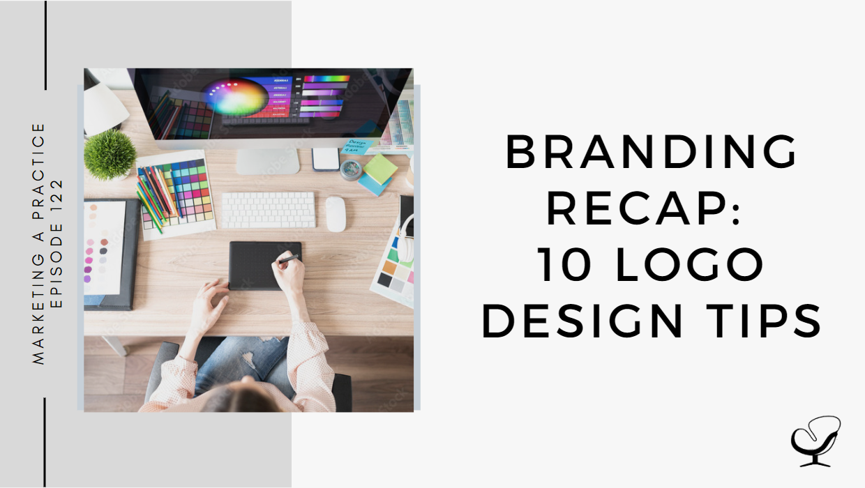
Do you need a quick refresh of the tenants of logo design? Why should you consider adding “visual salience” to your logo? How can you balance being literal and creative in your creative process?
In this podcast episode, Sam Carvalho speaks about 10 logo design tips.
Podcast Sponsor: Brighter Vision
When you’re in private practice it can be tough to find the time to even review your marketing efforts, let alone to make improvements where needed.
Whether you are a seasoned clinician with an existing website in need of a refresh, or a new therapist building a website for the first time, Brighter Vision is the perfect solution.
By first understanding your practice and what makes it unique, Brighter Vision’s team of developers are then able to create you a beautiful website that will attract your ideal clients and get them to contact you. Better yet, they also provide unlimited tech support to make sure it’s always up-to-date, and professional search engine optimization to make sure you rank high in online searches – all at no additional cost.
But best of all, we’ve worked with them to create a special offer just for Practice of the Practice listeners. Get your first 3 months of website service completely FREE. To take advantage of this amazing deal, head to brightervision.com/joe.
In This Podcast
A picture paints a thousand words
Use empty space to keep your logo space clean
Use shapes to think outside of the box
Imagine your logo in use
Color is the key to good logo design
Be literal with your logo
Be authoritative with your logo
Create visual salience with a pop of color
Don’t reinvent the wheel
Don’t be afraid to rejig the wheel
A picture paints a thousand words
A logo is a visual representation of your brand, so why tell people what you do if you can just show them?
Sam Carvalho
Use simple icons to communicate who you are. Hire a professional to design your logo because it can make all the difference to get creative as opposed to going with the obvious choice.
Use empty space to keep your logo space clean
You want to make sure that people can read your logo from a distance, or when it’s small, and including blank space will help achieve this.
At times, you could even find a really great font, increase the spacing between the letters, and you have yourself a minimalistic, sophisticated logo.
Sam Carvalho
Using blank space in your design makes your logo easier to integrate seamlessly into different designs and formats.
Use shapes to think outside of the box
Shapes are a great way to make your logo stand out. Consider using a simple square around your logo, which also works well with other designs and formats that your logo may appear in.
If you want to explore further, you could look into including gradients or textures which can push your design to the next level.
Imagine your logo in use
When designing your logo, make sure you think about its intended uses:
Are you looking to use it on a uniform?
Is it going to be printed on flyers?
Will it just be for your website?
You can always use a Mock Up Generator to see how your logo will look in use.
It’s also good to think about how you’re going to promote yourself when creating a logo. If you’re going to be doing a lot of networking … create a logo that will look good on business cards.
Sam Carvalho
Color is the key to good logo design
Use various shades of the same color to create subtle contrasts within your logo, instead of always opting for black and white.
Consider the PayPal logo, as they have used different shades of blue to create elements of contrast, but have still maintained a simple, powerful design.
Be literal with your logo
If your name is an object, include that object in your logo design.
Don’t be afraid to lean into the obvious. There’s a reason that Apple’s logo is, well, an apple. It’s simple, it’s obvious, but it’s one of the most renowned logo designs in the world.
Sam Carvalho
Be authoritative with your logo
Be literal while making sure it fits your organization.
Ask yourself: If I saw this logo for the first time, would I trust this company?
Keep in mind that a font can go a long way to helping you create the right logo.
Serif fonts help to create a more classic, professional feel.
Create visual salience with a pop of color
While it’s recommended to first design a logo in black and add color last, it is without a doubt the color that adds the finishing touch and brings the design to life.
This is called visual salience.
Salience is a quality that makes an object stand out against its surroundings. One easy way to do this is with a pop of color.
Sam Carvalho
Don’t reinvent the wheel
If it feels right, then go ahead and use it.
Have a look at your competitors and see what their logos look like. Are there any common themes or colors?
Take note of this, but be sure not to directly copy anybody else’s design.
Don’t be afraid to rejig the wheel
Transformation is necessary but gradual. Build your design over time on your established brand, so don’t trade the old for the new, and rather redesign the old.
Be bold and try new things.
Use patterns, overlapping shapes, and contrasting colors to create a modern logo while remembering that modernization doesn’t have to be outright to work.
Useful links mentioned in this episode:
If you’re ready to get started or just want to learn more about how Brighter Vision can help you grow your practice, head on over to brightervision.com/joe.
Sam Carvalho is a graphic designer living in Cape Town, South Africa, with over five years of experience in both design and marketing, with a special interest and experience in the start-up environment.
She has been working with Practice of the Practice since 2016 and has helped over 70 therapist entrepreneurs take their practices to the next level by enhancing their visual branding. She loves working with a variety of clients on design-intensive tasks and is always up for a challenge!
Feel free to leave a comment below or share this podcast on social media links below! Alternatively, leave a review on iTunes and subscribe!
Podcast Transcription
[SAM CARVALHO]
The Marketing a Practice Podcast will be coming to an end at the close of 2022 with the last episode being published on Thursday, December 29th. As such, I will be taking the month of December to review how to create great branding or improve on your current branding. The 126 episodes published will continue to remain available for you to listen to at any point if you’re feeling stuck in your branding or marketing. It’s been a pleasure going on this journey with you, and I hope you have found value in this content. I wish you all the best in marketing your practice.
Welcome to the Marketing a Practice podcast with me, Sam Carvalho, where you’ll discover everything you need to know about marketing and branding your business. To find out more about how I can help you brand new business visit www.practiceofthepractice.com/branding. If you’d like to see some examples of my design work, be sure to follow me on Instagram at Samantha Carvalho Design.
Nobody needs to tell you that logos are really important. We know this. They can, however, be daunting to design, but are an essential to any good business or personal brand. You want your logo to explain who you are and what you do, why you do it, and how you do it. You also want to keep in mind that your logo will be appearing everywhere, on social posts, presentation decks, marketing materials, business cards, and so much more. So it needs to be versatile enough to look good in a variety of formats. A good logo should be eye-catching, timeless, memorable, work well, large or small, and encompass your brand vibe. Because your logo design is such an important part of your business. As one of the last episodes of the Marketing a Practice Podcast, I wanted to review some logo design tips for you to make use of.
[SAM CARVALHO]
Number one is that a picture paints a thousand words. A logo is a visual representation of your brand, so why tell people what you do if you can just show them. You can do this by using simple icons to communicate who you are. This is where hiring a professional to design your logo can make all the difference as they will have the ability to really get creative with this as opposed to you maybe by mistake, including the most obvious thing that comes to mind. Number two is to use empty space to keep your logo designed clean. Coco Chanel once said, before you leave the house, look in the mirror and take one thing off, and the same thing applies to design. You want to make sure that people can read your logo from a distance or when it’s really small. Keeping it clean, or in other words, including a lot of blank space, will help you to achieve this. You most certainly do not need a whole bunch of colors or symbols to create a great logo. At times you could even find a rarely great font, simply increase the spacing between the letters and you have yourself a really minimalistic, sophisticated logo. Using blank space in your logo design is also helpful when it comes to things like brochure design, poster design, t-shirt printing, and other marketing collateral. It makes your logo easier to integrate seamlessly into different designs and formats.
[SAM CARVALHO]
Number three, use shapes to think outside of the box. Shapes are a really great way to make your logo stand out. For example, placing your company name inside a box can help to achieve a professional look. What’s more, this also helps with cross-platform branding as a boxed logo will always work well digitally as well as on things like letterheads, presentations and merchandise. If you want to explore shapes even further, you could look at including gradients or textures, which can help push your design to the next level. Number four, imagine your logo in use. When designing your logo, make sure that you think about its intended use. Are you looking to use it on a uniform, for example, or will it just be for your website? You can also always use a markup generator to see how your logo will look in use. It’s also good to think about how you’re going to promote yourself when creating a logo. If you’re going to be doing a lot of networking, for example, be sure that you create a logo that will look good on business cards. Regardless, it’s always a good idea to design a logo that can look good, whether it ends up appearing in a very small format or a very large format.
[BRIGHTER VISION]
When you’re in private practice, it can be tough to find the time to even review your marketing efforts, let alone to make improvements where needed. Whether you are a seasoned clinician with an existing website in need of a refresh or a new therapist, building a website for the first time, Brighter Vision is the perfect solution. By first understanding your practice and what makes it unique, Brighter Vision’s team of developers are then able to create you a beautiful website that will attract your ideal clients and get them to contact you.
Better yet, they also provide unlimited tech support to make sure it’s always up to date and professional Search Engine Optimization to make sure you rank high in online searches all at no additional cost. But best of all, we’ve worked with them to create a special offer just for the Marketing a Practice listeners. Get your first three months of website service completely free. To take advantage of this amazing deal, head on over to brightervision.com/joe. Again, that’s brightervision.com/joe.
[SAM CARVALHO]
Number five, color is key for good logo design. Keep in mind that monochromatic doesn’t always mean black and white. Sometimes black and white can actually be quite harsh on our eyes, especially if we’re trying to create a feeling of zen. Instead, you can use various shades of the same color to create subtle contrasts within your logo. Consider the paper logo, for example. They’ve used different shades of blue to create elements of contrast, but have still maintained a simple powerful design. Number six, be literal with your logo. If your name is an object, include that object in your logo design. Don’t be afraid to lean into the obvious. There’s a reason that Apple’s logo is well, an apple, it’s simple, it’s obvious, but it’s one of the most renowned logo designs in the world.
[SAM CARVALHO]
Number seven, be authoritative with your logo. Be literal, but make sure that it fits your organization. Private practice, for example, does demand a certain level of seriousness that a production company or ice cream shop can get away without. Ask yourself, if I saw this logo for the first time, would I trust this company? Keep in mind that a font can go a long way to helping you create the right logo. Serif fonts, especially help to create a more classic professional feel. Number eight, create visual salience with a pop of color. It can be said that color is the most valuable tool in a designer’s toolbox, and it’s no different when making a logo. While it’s definitely recommended to first design a logo in black and add color last, it is without a doubt the color that adds the finishing touch and brings the design to life. In design, we call this visual salience. Salience is a quality that makes an object stand out against its surroundings. One easy way to do this is with a pop of color. The Amazon logo is a great example of this.
[SAM CARVALHO]
Number nine, don’t reinvent the wheel. If it works, it works. Sometimes a bakery just needs a logo with weed on it. If it feels right, then go ahead and use it. Have a look at your competitors and see what their logos look like. Are there any common themes or colors? Take note of this, but be sure to not directly copy anybody else’s design. Number 10 is don’t be afraid to rejig the wheel. Pepsi has been around for 120 plus years as a brand, yet the modern Pepsi logo we know is drastically different from how it started. Do yourself a favor and Google it, but you’ll notice that the transformation from then to now was a gradual one. That’s because Pepsi was always building on the brand it had already established. It wasn’t trading its old brand for a new shiny one. It’s okay to be bold and try new things. You can use patterns, overlapping shapes and contrasting colors to create a more modern logo, but remember that modernization doesn’t have to be in your face in order to work.
Those are 10 tips on how to create a great logo or how to improve on your current logo. Many of them we’ve already been through in this podcast, but again, because this is the last month of the Marketing a Practice podcast, I thought I would rehash some of them to refresh your memory. I hope you found it helpful and I’ll see you in the next episode.
Thanks again to Brighter Vision for sponsoring this episode. To get your first three months of website service completely free, head on over to brightervision.com/joe.
Thanks for listening to the Marketing a Practice podcast. If you need help with branding your business, whether it be a new logo, rebrand, or you simply want some print flyer designed head on over to www.practiceofthepractice.com/branding. If you’d like to see some examples of my design work, be sure to follow me on Instagram at Samantha Carvalho Design.
Finally, please subscribe, rate, and review this podcast on iTunes if you like what you’ve heard. Talk to you soon.
Marketing a Practice podcast is part of the Practice of the Practice podcast network, a network of podcasts seeking to help you market and grow your business and yourself. To hear other podcasts like Beta Male Revolution, Empowered and Unapologetic, Imperfect Thriving, or Faith in Practice, go to practiceofthepractice.com/network.
This podcast is designed to provide accurate and authoritative information in regards to the subject matter covered. It is given with the understanding that neither the host, the publisher, or the guests are rendering legal, accounting, clinical, or any other professional information. If you want a professional, you should find one.
To provide the best experiences, we use technologies like cookies to store and/or access device information. Consenting to these technologies will allow us to process data such as browsing behavior or unique IDs on this site. Not consenting or withdrawing consent, may adversely affect certain features and functions.
Functional
Always active
The technical storage or access is strictly necessary for the legitimate purpose of enabling the use of a specific service explicitly requested by the subscriber or user, or for the sole purpose of carrying out the transmission of a communication over an electronic communications network.
Preferences
The technical storage or access is necessary for the legitimate purpose of storing preferences that are not requested by the subscriber or user.
Statistics
The technical storage or access that is used exclusively for statistical purposes.The technical storage or access that is used exclusively for anonymous statistical purposes. Without a subpoena, voluntary compliance on the part of your Internet Service Provider, or additional records from a third party, information stored or retrieved for this purpose alone cannot usually be used to identify you.
Marketing
The technical storage or access is required to create user profiles to send advertising, or to track the user on a website or across several websites for similar marketing purposes.