Where do the laws of great graphic design apply to? Do you want to connect more deeply and quickly with your ideal clients? What are some tenets of setting up eye-catching and effective design to connect with your audience?
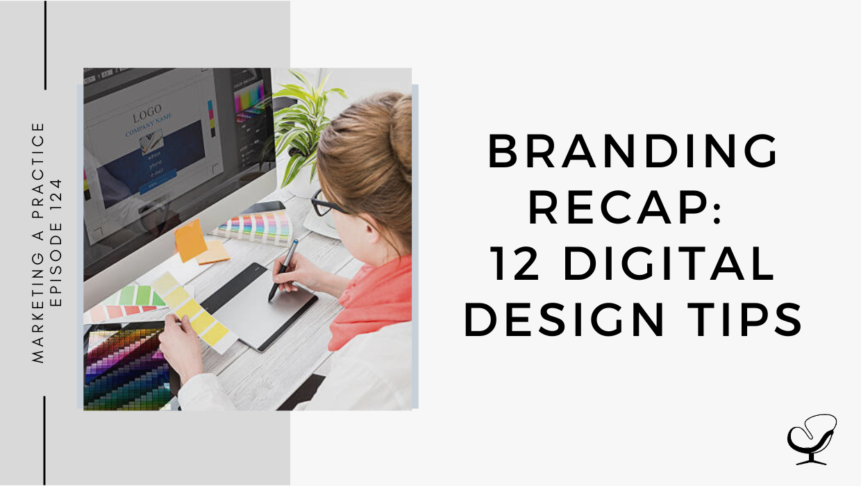
In this podcast episode, Sam Carvalho speaks about 12 digital design tips.
Podcast Sponsor: Therapy Notes
Is managing your practice stressing you out? Try TherapyNotes! It makes notes, billing, scheduling, and telehealth a whole lot easier.
Check it out and you will quickly see why TherapyNotes is the highest-rated EHR on TrustPilot with over 1000 verified customer reviews and an average customer rating of 4.9/5 stars.
You’ll notice the difference from the first day you sign up for a trial. They offer live phone support 7 days a week, so when you have questions, you can quickly reach someone who can help, and you are never wasting your time looking for answers.
If you are coming from another EHR, they make the transition really easy. TherapyNotes will import your clients’ demographic data free of charge during your trial so you can get going right away.
Use promo code ‘JOE’ to get three free months to try out TherapyNotes, no strings attached, and remember, telehealth is included with every subscription free. Make 2022 the best year yet with TherapyNotes.
In This Podcast
Limit your typefaces
Don’t be afraid of scale
Respect the space of other elements
Use a small color scheme
Create clean, crisp, clear imagery
Use fonts to help inform the mood of your design
Create order with alignment
Keep your designs simple
Use hierarchy to order your content
Keep your font in the same family
Use white space
Contrast is key
Limit your typefaces
When selecting a typeface or font for headings, subtitles, or body text, be sure to use easy-to-read fonts to create a simple and effective design.
Remember that the eye finds it hard to scan multiple typefaces, so try to stick to a simple collection of fonts.
Sam Carvalho
Don’t be afraid of scale
To acquire the appropriate emphasis, you can apply scale to:
type
shapes
compositional features
Additionally, use appropriate colors to enhance this technique while making sure to use suitable typefaces that look good when increased in size.
Sam’s design tip: sans serifs fonts are great for this
Respect the space of other elements
Use letter spacing to fill dead space, align text, or condense words that take up too much space.
However, be careful not to reduce letter spacing so much that it can’t be read, or increase it so much that the letters become detached from one another.
Sam Carvalho
Use a small color scheme
Choose a color scheme that has one to three primary colors and an additional one to three secondary colors that contrast and complement each other.
Try using different tones of the same color for consistency by adjusting the brightness for contrast.
Sam’s design tip: Keep in mind that finer typefaces will need stronger distinction against a color’s background.
Create clean, crisp, clear imagery
Pump up the contrast by adjusting the brightness of the background image so that it offsets the text color, making the design clear and easy to read.
This is a great way to apply white or black text over an image to create a strong ‘cut-out’ effect.
Sam Carvalho
Use fonts to help inform the mood of your design
Choose a typeface that sings the song of your content.
For example, typefaces with rounded edges usually give off a friendlier note, while hard-edged, geometric fonts are more solid and strong.
Alternatively, serifs can convey an elegant and sophisticated look.
Create order with alignment
Apply a line or an embellishment to a design for balance and composition.
Use horizontal and vertical lines to correspond with other design elements.
In a multi-page document, keep this alignment consistent across all pages to create a cohesive overall design.
Keep your designs simple
Keep [your design] simple, but don’t forget your basics. Make sure every element has a reason to be in the design and keep the number of fonts, colors, shapes, and frames to a minimum.
Sam Carvalho
Use contrasting tonal color combinations so that your text is sharp and easy to read. Apply a solid frame containing your to enhance the compositional structure of a design.
Use hierarchy to order your content
The most visually dominant feature in a design should be the most important part of the message.
Sam Carvalho
Apply color or scale to a graphic to see how it changes the hierarchy of elements and what grabs attention first.
Keep your font in the same family
Create visual uniformity by applying one typeface or font family to the text. Use a typeface or font family that has a selection of variants, such as italic, bold, and condensed, to keep options open.
Use white space
Create a fluid design by surrounding words with white space to let elements breathe. The application of space around text boxes, images, and other graphic elements makes a design easier to read and reduces visual clutter.
Contrast is key
Contrast is one of the most imperative parts of the design for mood, legibility, and to make it stand out:
Use a contrasting color palette background, fonts, and graphics.
Use photo filters to enhance the positive/negative space in an image
Apply black or white copy to create optimum contrast against a background image
A good rule of thumb is if you have a light-colored background, then you should use a dark font and vice versa.
Sam Carvalho
Useful links mentioned in this episode:
Use promo code ‘JOE’ to get three free months to try out TherapyNotes, no strings attached, and remember, telehealth is included with every subscription free.
Sam Carvalho is a graphic designer living in Cape Town, South Africa, with over five years of experience in both design and marketing, with a special interest and experience in the start-up environment.
She has been working with Practice of the Practice since 2016 and has helped over 70 therapist entrepreneurs take their practices to the next level by enhancing their visual branding. She loves working with a variety of clients on design-intensive tasks and is always up for a challenge!
Feel free to leave a comment below or share this podcast on social media links below! Alternatively, leave a review on iTunes and subscribe!
Podcast Transcription
[SAM CARVALHO]
The Marketing and Practice Podcast will be coming to an end at the close of 2022 with the last episode being published on Thursday, December 29th. As such, I will be taking the month of December to review how to create great branding or improve on your current branding. The 126 episodes published will continue to remain available for you to listen to at any point if you’re feeling stuck in your branding or marketing. It’s been a pleasure going on this journey with you, and I hope you have found value in this content. I wish you all the best in marketing your practice.
Welcome to the Marketing a Practice podcast with me, Sam Carvalho, where you’ll discover everything you need to know about marketing and branding your business. To find out more about how I can help you brand new business visit www.practiceofthepractice.com/branding. And if you’d like to see some examples of my design work, be sure to follow me on Instagram at Samantha Carvalho Design.
Whether you’re creating videos for social media or designing invitations for an upcoming event, the application of graphic design is vast and versatile. From font pairing and scale to alignment and white space, the facets of the design world are complex. So here are some design tips to help you through the pits and peaks of the digital design creative process. Number one, limit your typefaces. When selecting a typeface or font for headings, subtitles, or body text, be sure to use easy-to-read font to create a simple and effective design. Remember that the eye finds it hard to scan multiple typefaces, so try to stick to a simple collection of fonts. Number two, don’t be scared of scale. Consider applying scale to type, shapes or compositional features that need proportionate emphasis. You could also use appropriate colors to enhance this technique while making sure to use suitable typefaces that look good when increased in size. San Serif fonts are usually great for this.
[SAM CARVALHO]
Number three, respect the space of other elements. Use letter spacing to fill dead space, aligning text or condense words that take up too much space. However, be careful not to reduce letter spacing so much that it can’t be read or increase it so much that the letters become detached from one another. But spacing between letters is a great way to play around with different options of design, as well as ensuring that you make the best use of the space provided in your design. Number four, use a small color scheme. Choose a color scheme that has 1, 2, 3 primary colors and an additional 1, 2, 3 secondary colors at the most that contrast and complement each other. Try using different tone of the same colorful consistency by adjusting the brightness for contrast. Keep in mind that finer type faces will need stronger distinction against a color background.
[SAM CARVALHO]
Number five, create clean, crisp, clear imagery. Pump up the contrast by adjusting the brightness of the background image so that it offsets the text color, making the design clear and easy to read. This is a great way to apply white or black text over an image to create a strong cutout effect. Number six, use fonts to help inform the mood of your design. Choose a typeface that sings the song of your content. For example, typefaces with rounded edges are usually a friendlier note while hard edged geometric fonts are more solid and strong. Serifs, on the other hand, can convey an elegant and sophisticated look. Number seven, create order with alignment. Apply a line or an embellishment to a design for balance and composition. Use horizontal and vertical lines to correspond with other design elements. If creating a multi-page document, be sure to keep this alignment consistent across all pages to create a cohesive overall design.
[THERAPY NOTES]
Is managing your practice stressing you out? Try Therapy Notes. It makes notes, billing, scheduling, and tele-health a whole lot easier. Check it out and you will quickly see why it’s the highest rated EHR on Trustpilot with over 1000 verified customer views and an average customer rating of 4.9 out of 5 stars. You’ll notice the difference from the first day you sign up for a trial. They offer live phone support seven days a week so when you have questions, you can quickly reach out to someone who can help. You are never wasting your time looking for answers.
If you’re coming from another EHR, they make the transition really easy. Therapy Notes will import your clients’ demographic data free of charge during your trial so you can get going right away. Use the promo code [JOE], that’s J-O-E to get three free months to try Therapy Notes for free, no strings attached, and remember, telehealth is included with every subscription free. Make 2022 the best year yet with Therapy Notes.
[SAM CARVALHO]
Number eight, keep your designs simple. Keep it simple, but don’t forget your basics. Make sure every element has a reason to be in the design and keep the number of fonts, colors, shapes and frames to a minimum. Use contrasting tonal color combinations so that your text is sharp and easy to read. Applying a solid frame to contain your copy can also enhance the compositional structure of a design. Number nine, use hierarchy to order your content. The most visually dominant feature in a design should be the most important part of the message, so apply color or scale to a graphic to see how it changes the hierarchy of elements and white grabs attention first.
Number 10, keep your font in the same family. Create visual uniformity by applying one typeface or font family to text. Use a typeface or font family that has a selection of variance, for example, italic bold and condensed to keep options open. Number 11, use white space. Create a fluid design by surrounding words with white space to let elements breathe. The application of space around text boxes, images, and other graphic elements makes a design easier to read. It’s also more likely to attract attention than a cluttered composition. Number 12, contrast is key. Contrast is one of the most imperative parts of the design for both mood, legibility and to make it stand out. Use a contrast in color palette, background, font, and graphics. Use photo filters to enhance the positive or negative space in an image and apply black or white copy to create optimum contrast against a background image. A good rule of thumb is if you have a light-colored background, then you should use a dark font and vice versa.
So just to go over the digital design tips from today’s episode, number one, limit your typefaces, number two, don’t be scared of scale, number three, respect the space of other elements. Number four, use a small color scheme, number five, create clean, crisp, clear imagery, number six, use font to help inform the mood of your design, number seven, create order with alignment, number eight, keep your design simple. Number nine, use hierarchy to order your content, number 10, keep your font in the same family, number 11, use white space and number 12, contrast is key.
Be sure to check out any other episodes that I have on digital design to help you improve your digital design within your practice. I hope that you found value in this episode and I’ll see you in the next one.
[SAM CARVALHO]
Thanks again to Therapy Notes for sponsoring this episode. Remember to use the promo code, [JOE], that’s J-O-E to get three free months to try out Therapy Notes for free, no strings attached.
Thanks for listening to the Marketing a Practice podcast. If you need help with branding your business, whether it be a new logo, rebrand, or you simply want some print flyer designed head on over to www.practiceofthepractice.com/branding. And if you’d like to see some examples of my design work, be sure to follow me on Instagram at Samantha Carvalho Design.
Finally, please subscribe, rate, and review this podcast on iTunes if you like what you’ve heard. Talk to you soon.
Marketing a Practice podcast is part of the Practice of the Practice podcast network, a network of podcasts seeking to help you market and grow your business and yourself. To hear other podcasts like Beta Male Revolution, Empowered and Unapologetic, Imperfect Thriving, or Faith in Practice, go to practiceofthepractice.com/network.
This podcast is designed to provide accurate and authoritative information in regards to the subject matter covered. It is given with the understanding that neither the host, the publisher, or the guests are rendering legal, accounting, clinical, or any other professional information. If you want a professional, you should find one.
To provide the best experiences, we use technologies like cookies to store and/or access device information. Consenting to these technologies will allow us to process data such as browsing behavior or unique IDs on this site. Not consenting or withdrawing consent, may adversely affect certain features and functions.
Functional
Always active
The technical storage or access is strictly necessary for the legitimate purpose of enabling the use of a specific service explicitly requested by the subscriber or user, or for the sole purpose of carrying out the transmission of a communication over an electronic communications network.
Preferences
The technical storage or access is necessary for the legitimate purpose of storing preferences that are not requested by the subscriber or user.
Statistics
The technical storage or access that is used exclusively for statistical purposes.The technical storage or access that is used exclusively for anonymous statistical purposes. Without a subpoena, voluntary compliance on the part of your Internet Service Provider, or additional records from a third party, information stored or retrieved for this purpose alone cannot usually be used to identify you.
Marketing
The technical storage or access is required to create user profiles to send advertising, or to track the user on a website or across several websites for similar marketing purposes.