So you’re starting your new practice and are trying to figure out how to decorate. Picking out a comfortable couch, a desk, and a coffee mug might be as far as you’ve gotten. It might not seem like it, but picking out the right colors, shapes and textures have a significant impact on the client experience. The perceptions of the client-therapist rapport have a determining role in the perceived outcome of counseling, so helping our clients feel as comfortable and calm as possible is important.
It’s strange to think that something like color can impact a person’s feelings, mood, and perception, but think about a business such as McDonald’s. They use the color red in their branding, a color that research shows is stimulating and evokes hunger. What better choice for a hamburger joint! Why not get in on the action and learn what shades encourage feelings of trust, depending, and vulnerability.
Color Scheme
Let’s start by picking your color scheme. Having a consistent color palette strengthens your brand and provides continuity for your target market. You wouldn’t see a blue and green McDonald’s, that would be strange and confusing! The internet is full of advice on what colors to choose; colors to elicit appetite, colors to build trust, colors to promote harmony. There’s a bunch of information on picking complementary or contrasting colors. It’s a lot to digest, and it’s ok to start small! The important thing is to choose colors that suit your needs, and that can be consistently applied to your brand.
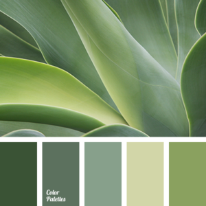
Green
There are many great options for your business, so it’s all about picking what feeling you feel your target market will be drawn to. If spring colors are your thing, green evokes a sense of balance in a company. Soft hues of green can create feelings of harmony that are comforting to our clients. It has roots in nature and the earth which makes it a perfect balance between practical and emotional, just like your practice. Colors such as sage, mint, olive, and pear are great choices for the main color. Remember to dilute colors for your walls, and to enhance them for accents such as your logo.
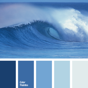
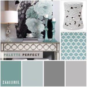
Blue
If green isn’t your favorite, check out blue. Blue indicates trust, reliability, and stability. It’s grounded but still full of life. While it isn’t as flashy as some of the warm colors, it’s still the best choice for creating a calming, serene environment that will help your clients decompress in your office. Hues such as sky, cadet, and stone and cool blues that would complement many other supporting colors. Rather than using a fully pigmented color for your office walls, pick a blue base of color in the lightest shade or two. You can use deeper and more vibrant blues in your pillows, blankets, and decorations.
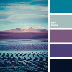
Purple
Often associated with royalty, purple can also indicate courage, imagination, and spirituality. Much like green, it calls up a blend of magic and stabilizing energy. Purple can have a soothing effect, but just be careful to not use it as the dominant color as people may tend to dive too deep into introspection. We want that for our clients, but we also want them to stay rooted in reality! Use hues such as lilac, lavender, and heather to really bring out the soft effects of purple.
Cool colors
My personal favorite palette uses the undertones of any of the cool colors but incorporates a lot of soft grays. This is a way to reinforce your branding in a color subtle enough to put on the walls. I use Valspar paints and like using White Pepper as my lightest color. Your preferred paint provider should have complementary palettes that will help you pick your brand colors. Light grays create a soothing and grounded energy without having the nursery feel of a light blue. Gray with a blue, green, or purple undertone will also complement many other colors you may choose to add to your office.
 Katie Hido is the owner of Gray Cat Counseling, and a Licensed Professional Counselor. She has been in the field for over 5 years and currently specializes in communication skills and adult attachment therapy. Her practice focuses on helping adults struggling with corporate burnout and issues with connection to improve their boundaries and quality of life.
Katie has a Masters in Philosophy from Duquesne University, concentrating on phenomenology and existentialism. She took that perspective and decided to use it to help others cope with issues such as time, death, and existence. Katie completed her Masters in couples counseling from Duquesne while working with children and teens in a residential treatment facility. She worked with adults and teens in a substance use facility, then provided therapy at a community agency.
Katie trained in Emotionally Focused Couples therapy and used those skills to work with couples and to build a behavioral health department for her local Planned Parenthood affiliate. Currently, she is focused on building up Gray Cat Counseling and promoting her blog, as well as wrangling her many cats, reptiles, and chickens in rural Western Pennsylvania. You can reach out to her through her website at graycatcounseling.com.