Podcast (marketing-podcast): Play in new window | Download | Embed
Why should you stick to a small color scheme in your digital designs? How do you use hierarchy to order your digital content? What benefits are there to using white space in your design?
Podcast Sponsor: Brighter Vision

How would you like to fall into cash this month? Every year, my friends over at Brighter Vision kick off the fall season with a month-long digital conference event they call ‘Fall Into Cash’.
For the entire month of September, they’ll be teaming up with the top brands, consultants, and coaches in the mental health industry to provide you with the best advice, tools, content, podcasts, and giveaways; all centered around one main theme – helping you grow your practice and make more money.
Plus, in celebration of the 5th anniversary of ‘Fall Into Cash’, they’re also offering a very special discount exclusively for Practice of the Practice listeners. From now until the end of the month, they’re offering new websites for only $49/month for your whole first year plus no setup fees – that’s a savings of over $200!
For more information and to take advantage of this great offer, head on over to brightervision.com/joe.
In This Podcast
- Limit your typefaces
- Use a small color scheme
- Create clean, crisp, and clear imagery
- Keep your designs simple
- Use hierarchy to order your content
- Use white space
- Use cohesive design elements
- Make good use of spacing
- Know the dimensions you need beforehand
- Know what type of file you need when downloading
1. Limit your typefaces
When selecting a typeface or font for headings, subtitles, and body text, use easy-to-read fonts for simple and effective graphic design. The eye finds it hard to scan multiple typefaces, so stick to a simple collection of fonts.
You could create visual uniformity by applying one typeface or font family to the text. Use a typeface or font family that has a selection of variants, such as italic, bold, condensed, and so forth to keep options open.
Pay attention to how the fonts inform the mood of your design. Typefaces with rounded edges are usually friendlier, while hard-edged geometric fonts are solid, and serifs convey an elegant and sophisticated look.
2. Use a small color scheme
Choose a color scheme that has 1-3 primary colors and an additional 1-3 secondary colors that contrast and complement each other.
Use different tones of the same color for consistency by adjusting brightness for contrast. Finer typefaces will need stronger distinction against a colored background.
3. Create clean, crisp, and clear imagery
Pump up contrast by adjusting the brightness of the background image so that it offsets the text color, making the design clear and easy to read.
You could also include a transparent black/white shape over the image, but under the text, to enhance the contrast. This is a great way to apply white or black text over an image to create a strong ‘cut-out’ effect.
4. Keep your designs simple
Keep it simple but don’t forget your basics. Make sure every element has a reason to be in the design and keep the number of fonts, colors, shapes, and frames to a minimum. (Sam Carvalho)
Use contrasting tonal color combinations so that your text is sharp and easy to read.
Apply a solid frame to contain your copy because it will also enhance the compositional structure of your design.
5. Use hierarchy to order your content
The most visually dominant feature in a design should be the most important part of the message.
Apply color or scale to a graphic to see how it changes the hierarchy of elements and what grabs the attention first.
6. Use white space
Create a fluid design by surrounding words with white space to let elements breathe.
The application of space around text boxes, images, and other graphic elements makes a design easier to read. It’s also more likely to attract attention than a cluttered composition.
7. Use cohesive design elements
When you add design elements to your project, they must have a cohesive style between them. This applies to all graphic elements, from icons to illustrations, and even font styles. For example, use all-line icons instead of a mix of line and 3D. (Sam Carvalho)
Mix squares with rounded corners with other curved elements. Straight-angled shapes with straight lines.
Alternatively, break the rules and mix curves with straight lines, as long as you keep a cohesive texture and color palette.
8. Make good use of spacing
Good spacing is one of the most important tools when it comes to creating a balanced composition. You find spaces in:
- margins
- between shapes
- paragraphs
- lines
- words
- between letters
Space is essentially white space, as we mentioned above. The difference is that in this case, it acts as a rule to help you align elements, keep them balanced, and complement each other.
9. Know the dimensions you need beforehand
Never start a project without knowing exactly what size it needs to be. Even though you can change the size later, you’ll have to readjust everything to fit into the new size. (Sam Carvalho)
Dimensions are measured in two ways:
- The length and width in pixels
- The aspect ratio
Both of these aspects are important to know when designing. The aspect ratio is the relationship of the size to the width of a design, it can have different numerical values, but will always have the same shape.
10. Know what type of file you need when downloading
Similar to how you need to know the size of your graphics beforehand, you also need to know the type of file to download when you have finished your work.
For example, do you need a JPG for a web image or a PNG for a cut-out design with a transparent background?
Analyze what you will need before you start so you can design accordingly. Afterward, download what you need plus any other options that you may also need.
Useful links mentioned in this episode:
- Brighter Vision – Receive the first year of websites at $49 a month
- www.practiceofthepractice.com/network
- www.practiceofthepractice.com/branding
- How to Choose Colors and Fonts to Match Your Branding | MP 46
Check out these additional resources:
- Design Sprint 2 of 4: 10 Tips for Great Web Design | MP 79
- Email Sam at [email protected]
- Design Services With Sam
- Apply to work with us
Meet Sam Carvalho
 Sam Carvalho is a graphic designer living in Cape Town, South Africa, with over five years of experience in both design and marketing, with a special interest and experience in the start-up environment.
She has been working with Practice of the Practice since 2016 and has helped over 70 therapist entrepreneurs take their practices to the next level by enhancing their visual branding. She loves working with a variety of clients on design-intensive tasks and is always up for a challenge!
Follow Sam on Instagram to see some of her work. To work with Sam, head on over to www.practiceofthepractice.com/branding.
Thanks For Listening!
Feel free to leave a comment below or share this podcast on social media by clicking on one of the social media links below! Alternatively, leave a review on iTunes and subscribe!
Podcast Transcription
[SAM CARVALHO]
Welcome to the Marketing a Practice podcast with me, Sam Carvalho where you’ll discover everything you need to know about marketing and branding your business. To find out more about how I can help you brand new business visit www.practiceofthepractice.com/branding. And if you’d like to see some examples of my design work, be sure to follow me on Instagram at Samantha Carvalho Design.
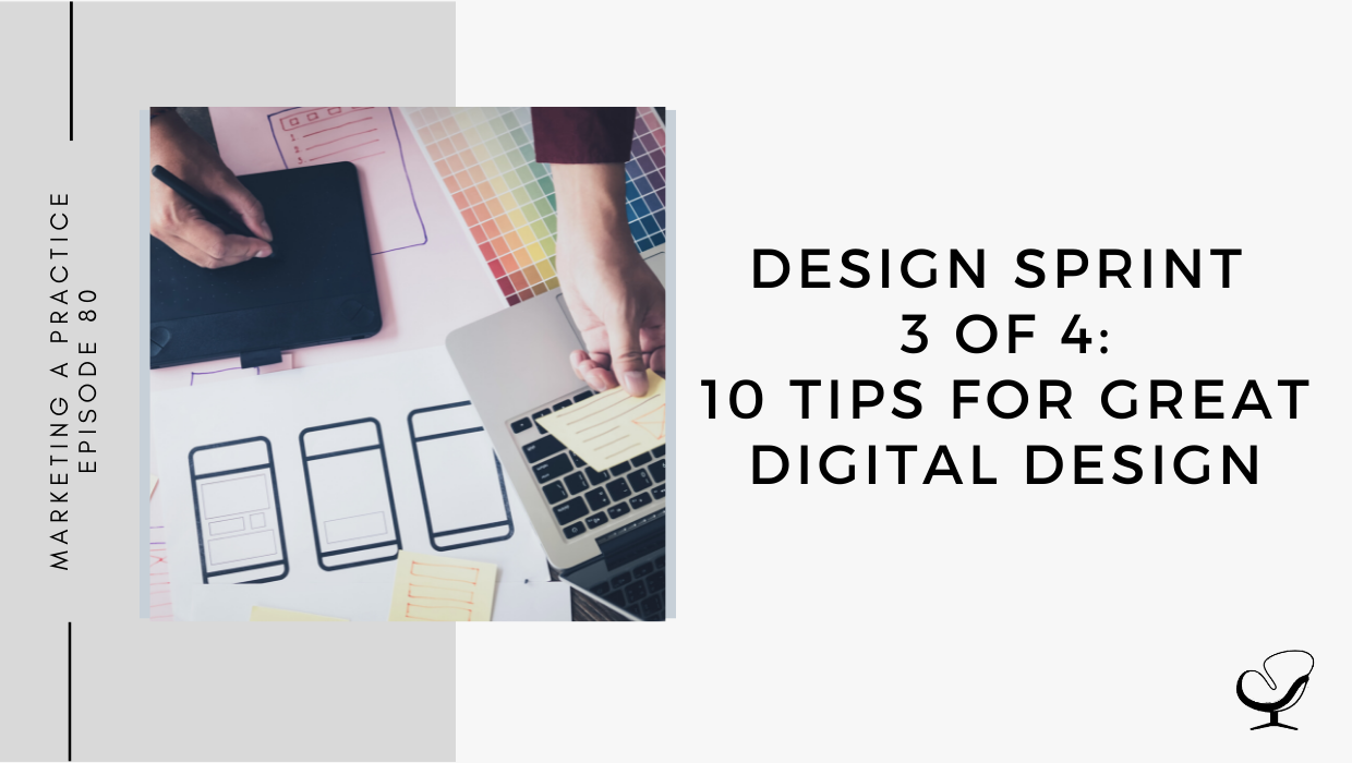
Hi there. Thanks so much for joining me today on the Marketing a Practice podcast. This is part three of the part four design sprint I’ve been busy with. So if you’ve missed the first two episodes on logo design and web design, be sure to go give them a listen. In today’s episode, we’ll be discussing digital design and in the next episode, we’ll be discussing print design. These are quickfire episodes so if you’re on the move while you’re listening to this, we will have all the content available in the show notes, but without further ado, let’s dive into digital design. So whether you’re creating social media graphics or designing digital invitations for an upcoming event, the application of graphic design is vast and versatile. So here are 10 tips on how to create great digital designs.
Number one, limit your typefaces. When selecting a typeface or font for headings, subtitles, and body text use easy to read fonts for simple and effective graphic design. I find it hard to scan multiple typefaces. So stick to a simple collection of fonts. You could create visual uniformity by applying one typeface or font family to text. Use a typeface or font family that has a selection of variance, such as italic, bold, condensed, et cetera, to keep options open. Also pay attention to how the fonts inform the mood of your design. Typefaces with rounded edges are usually friendlier while hard edged geometric fonts are solid and strong and give confined elegant and sophisticated look. If you want to know more about typefaces and fonts, be sure to refer to previous episodes I’ve done on this.
Number two is to use a small color scheme. Choose the color scheme that has one to three primary colors and an additional one to three secondary colors that contrast and compliment each other. Use different tones of the same color for consistency by adjusting brightness for contrast. Find a type basis when we need stronger distinction against the kind of background. Again, if you want to learn more about color theory, be sure to check out a previous episode I’ve done on the topic.
Number three, clean, crisp, and clear imagery. Pump up contrast by adjusting the brightness of the background image so that it offsets the text color, making design clear and easy to read. You could also include a transparent black or white shape over the image, but under the text to enhance the contrast. This is a great way to apply white or black text over an image to create a strong cutout to fit.
Number four, keep your design simple. Keep it simple, but don’t forget your basics. Make sure every element has a reason to be in the design and keep the number of funds, colors, shapes, and frames to a minimum. Use contrast internal color combinations so text is sharp and easy to read. Applying a solid frame to contain your copy will also enhance the compositional structure of a design.
Number five use hierarchy to order your content. The most visually dominant feature in the design should be the most important part of the message. Apply color or scale to a graphic to see how it changes the hierarchy of elements and what grabs attention most.
[BRIGHTER VISION]
How would you like to fall into cash this month? Every year, my friends over at Brighter Vision kick off the full season with a month long digital conference event they call Fall Into Cash. For the entire month of September, there’ll be teaming up with the top brands, consultants, and coaches in the mental health industry to provide you with the best advice, tools, content, podcasts, and giveaways, all centered around one main theme, helping you grow your practice and make more money. Plus, in celebration of the fifth anniversary of Fall Into Cash, they’re also offering a very special discounts exclusively for Practice of the Practice listeners. From now until the end of the month, they’re offering new websites for only $49 per month for your whole first year, plus no setup fees. That’s a savings of over $200. For more information, and to take advantage of this great offer head on over to brightervision.com/joe. That’s brightervision.com/joe.
[SAM CARVALHO]
Number six, use white space. Create a fluid design by surrounding words with white space to let elements breathe. The application of space around textboxes, images, and other graphic elements make a design easier to read. It’s also more likely to attract attention than a cluttered composition.
Number seven, use cohesive design elements. When you add design elements to your project, they must have a cohesive style between them. This applies to all graphic elements from icons to illustrations and even fun styles. For example, use all line icons instead of a mix of line in 3D. Make squares with rounded corners with other curved elements, straight angled shapes with straight lines. Alternatively break the rules and mixed curves with strangling lines as long as you keep a cohesive, texture and color pallet.
Number eight, make good use of spacing. Good spacing is one of the most important tools when it comes to creating balanced competition. You find spaces in margins, between shapes, paragraphs, lines, words, and even between the letters. Space is essentially white space as we mentioned above. The difference is that in this case, it acts as a rule to help you align elements, keep them balanced and compliment each other. Grids, for example, use specific spacing majors to create a base for any design.
Number nine, know the dimensions you need beforehand. Never start a project without knowing exactly what size it needs to be. Even though you can change the size later, you’ll have to adjust everything to fit into the new size. Dimensions are measured in two ways. The length and width in pixels and the aspect ratio. Both are important to know in designing. The aspect ratio is the relationship of the size to the width of the design. It can have different numerical values, but will always have the same shape.
And finally, number 10, know what type of file you need when downloading. Just how you need to know the size of your graphics beforehand, you also need to know the type of file to download when you’re done. For example, do you need a JPEG for a wave image or a PNG for a cutout design with a transparent background? And last what you’ll need before you start, you can design accordingly, then download what you need, plus any options you might also need.
So the 10 tips for great digital design are as follows. Number one, limit your type basis. Number two, use a small color scheme. Number three, create clean, crisp and clear imagery. Number four, keep your design simple. Number five, use hierarchy to order your content. Number six, use white space. Number seven, use cohesive design elements. Number eight, make good use of spacing. Number nine, know the dimensions you need beforehand. And number 10, know what type of file you need when downloading.
Thanks so much for being a part of this episode. I will see you in the fourth and final part of the design sprint in the next episode on print design.
Thank you to Panavision for sponsoring this episode. Remember that for the entire month of September, they’re offering new websites for only $49 per month for your whole first year plus no setup fees. That’s a savings of over $200. Be sure to head over to brightervision.com/joe to make use of this very special discount.
Just a headups that I will be going on maternity leave from November, 2021 to February, 2022, and will therefore be taking a break from podcasting. I will most likely begin producing episodes again from March, 2020. Thank you for your understanding and keep well.
Thanks for listening to the Marketing a Practice podcast. If you need help with branding your business, whether it be a new logo, rebrand, or you simply want some print flyer designed head on over to www.practiceofthepractice.com/branding. And if you’d like to see some examples of my design work, be sure to follow me on Instagram at Samantha Carvalho Design.
Finally, please subscribe, rate, and review this podcast on iTunes if you like what you’ve heard. Talk to you soon.
Marketing a Practice podcast is part of the Practice of the Practice podcast network, a network of podcasts seeking to help you market and grow your business and yourself. To hear other podcasts like Beta Male Revolution, Empowered and Unapologetic, Imperfect Thriving, or Faith in Practice, go to practiceofthepractice.com/network.
This podcast is designed to provide accurate and authoritative information in regards to the subject matter covered. It is given with the understanding that neither the host, the publisher, or the guests are rendering legal, accounting, clinical, or any other professional information. If you want a professional, you should find one.